Taking Colgate’s original toothbrush package, I created a more sustainable, educational and fun package that promotes oral hygiene while still making it hygienically safe.
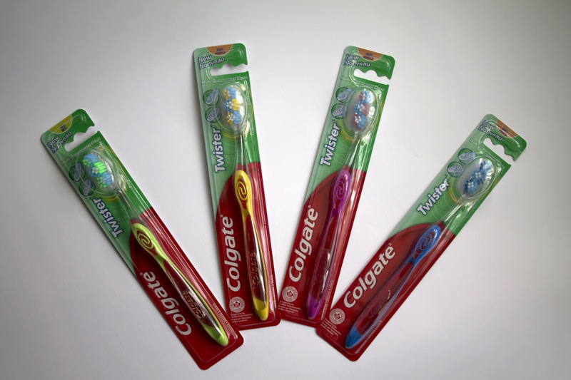
Original Colgate ‘Twister’ toothbrush packaging
Toothbrushes are packaged typically in a sealed plastic container with a cardboard backing, or in a plastic sealed bag. The packaging, especially sold in store, has a lot of information printed on the package but with very little space to actually display the information, forcing the type to be small and crammed on the back of the package. It often has diagrams advertising how this new brush style is even better than the old one, crowding the back with information most people don’t even look at, creating a package that is busy, unattractive and unsustainable.
Through research I found that Americans spent 50 times more on hair products than dental care products. People need to be more interested in maintaining their oral health and I decided to use that to help leverage my design.
I wanted to create more meaning behind my redesigned package then just sustainability, as the primary concern that toothbrushes deal with is oral health.
Promoting oral health involved rebranding the toothbrushes. As Colgate often has special product lines within their own brand such as the ‘Twister’ toothbrush I was working with, branding a special set of toothbrushes within the Colgate brand was acceptable.
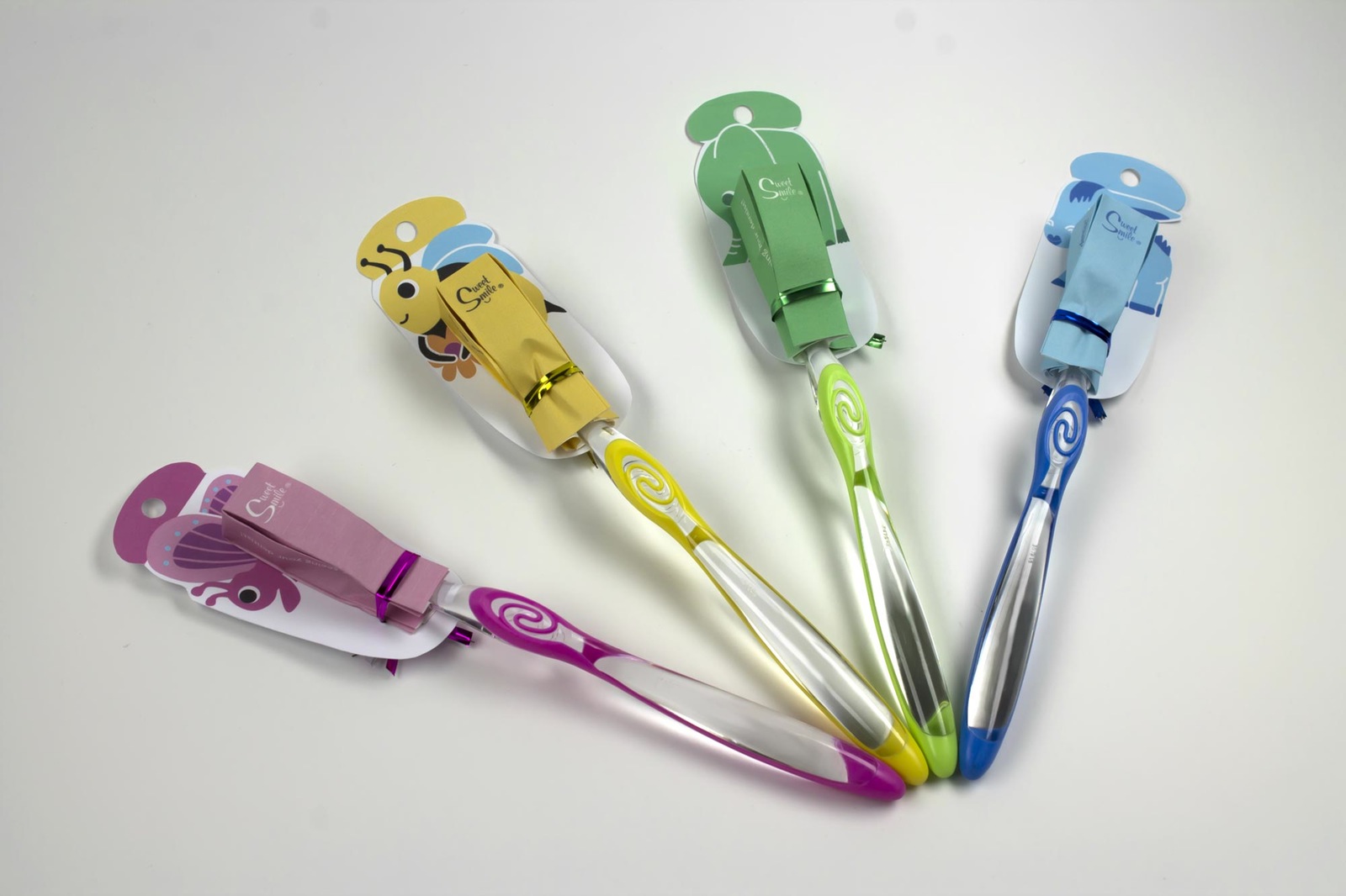
The Sweet Smile toothbrush package unwrapped
Getting youth interested in maintaining good oral health would help them maintain the interest going into adulthood. So I worked to create a fun, colourful package that would engage youth in the form of toothbrush samples from the dentist. As a promotional item, it would help create a better relationship between patient and dentist to encourage better oral health as brushing your teeth is not a substitute for seeing the dentist, and patients need to be encouraged to go back.
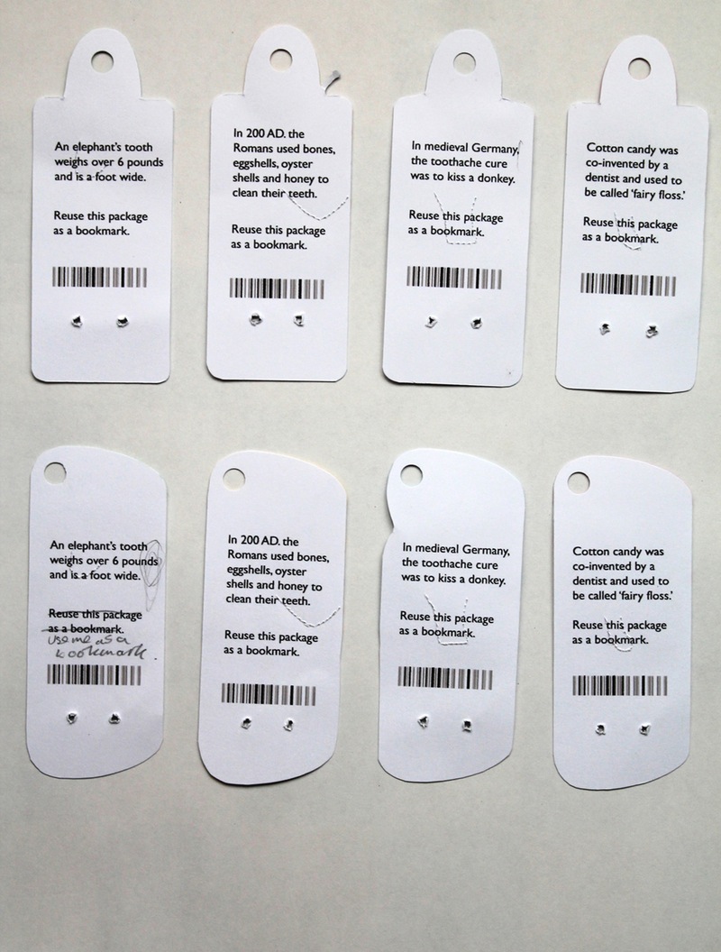
Fun facts on the back of the toothbrush package
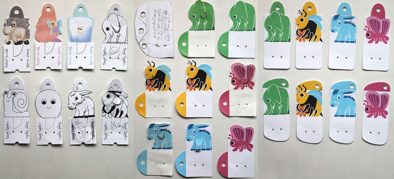
To help engage people more with the toothbrush, I selected several fun facts I found through my research to include on the backs of the toothbrushes. Each toothbrush backing has an animal or a bug illustration on the front, coordinated with the fact on the back.
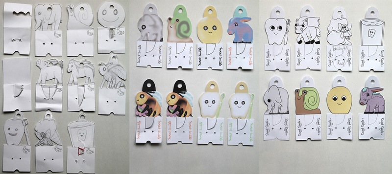
Toothbrush backing prototypes
Toothbrush backing prototypes
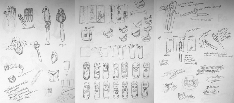
Deciding which facts, which characters and which character style to use went through several trials and revisions. I had to cut it down to four different ones as each toothbrush style within a brand only ever had four different colours. Eventually two bugs and two animals were chosen to keep it as a family set.
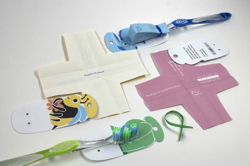
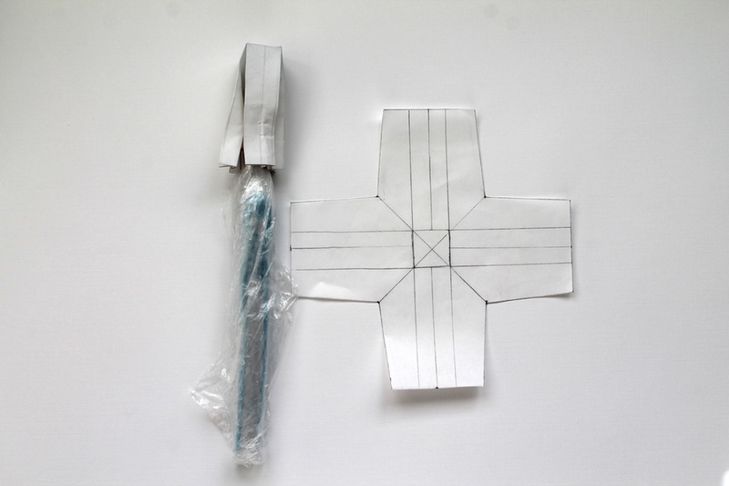
The biggest challenge was to reduce the packaging without making it unhygienic. I noticed that when packaging the toothbrushes, the whole toothbrush would be covered even though to keep it clean only the bristles needed to be covered.
Toothbrush cover prototype
Sketches for alternate toothbrush covers
Coming up with a system that would protect only the bristles was a challenge. I switched the plastic casting to paper, as it could be recycled. Figuring out how to cleanly enclose the toothbrush bristles was also a challenge. Folds had to be clean as even the suggestion of something ‘dirty or unkempt’ would turn people off from the product.
Toothbrush cover prototypes
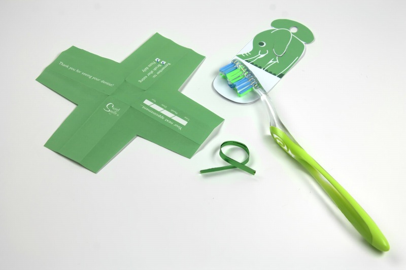
Green toothbrush with packaging
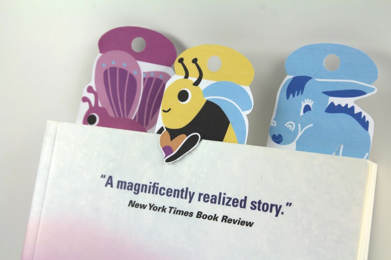
Toothbrush backings have a second-life as bookmarks
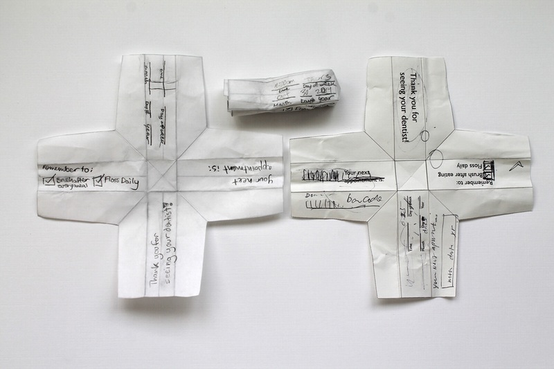
Because I was making this for use at the dentist, I designed the cover of the toothbrush to serve as an appointment reminder. This tied into its use and also the idea of sustainability as the cover could be reused before thrown away. The backing for the toothbrush is also reusable as a bookmark, and the twist tie holding the two pieces together could be reused again on other applications.