A new magazine for the Canadian sailing community.
Harbour presents a different aesthetic than the majority of sailing magazines on the market today, marketing towards a younger demographic and bringing a fresh face to shelves around the country.
Sailing in Canada is a large and profitable industry, with access to the Great Lakes as well as two beautiful oceans. Those who sail know how much these kinds of activities breed a close and connected community, both at the harbours and out on the water. I wanted to bring that kind of community feeling into a publication that could widen the reach of sailors and manufacturers in Canada.
However, the market for sailing magazines is usually catered to the older generation of wealthy, retired sailors. These magazines do not necessarily suit the younger sailors, or use colours, images and design that will entice this generation to get involved in the sailing world.
I started this project by doing research into the sailing magazines that were on the market already, and analyzing them to see what was lacking. I worked on creating a name that would be simple and relevant to the sailing community, but would avoid sounding like the rest of the ones in production already, such as “Canadian Yachting” and “Ontario Sailor”. I created a detailed specification sheet of all the different parts of the magazine and how they should be treated, but these elements evolved a lot throughout the process of creating the magazine.
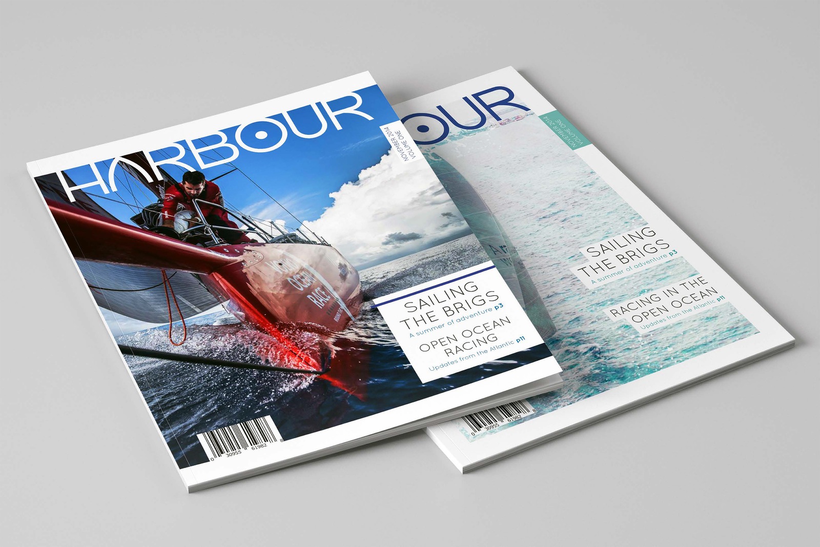
I created far too many masthead and cover variations, as it was difficult for me to find photography of sailboats that fit the new narrative I was trying to create with Harbour. I ended up combining an image of a mid-sized sailboat with an overlaid image of waves to create a double exposure with bright teals and blues, reminiscent of days by the water, but without the traditional navy blues and reds. I used a different, darker version of the cover on the back, which is more in line with the existing market for these magazines.
One of the things I wanted to accomplish with this magazine was bringing the quality of communication that happens at harbours and marinas, between fellow sailors and boat owners, and making it into a publication. Growing up, when I had the opportunity to be surrounded by boats and their sailors, I was always so happy to just hear the stories passed around and information traded freely. Everyone was always friendly, taking every chance to sit down and tell you a story, or lend a hand if you looked like you needed it.
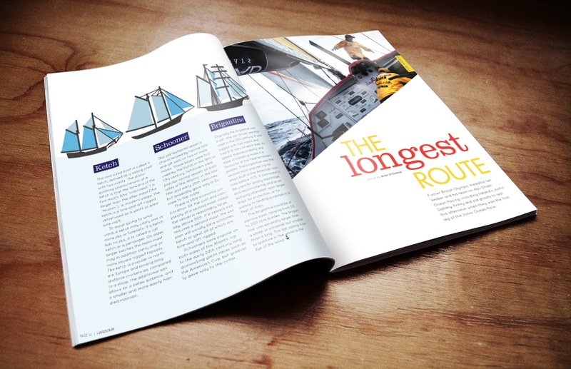
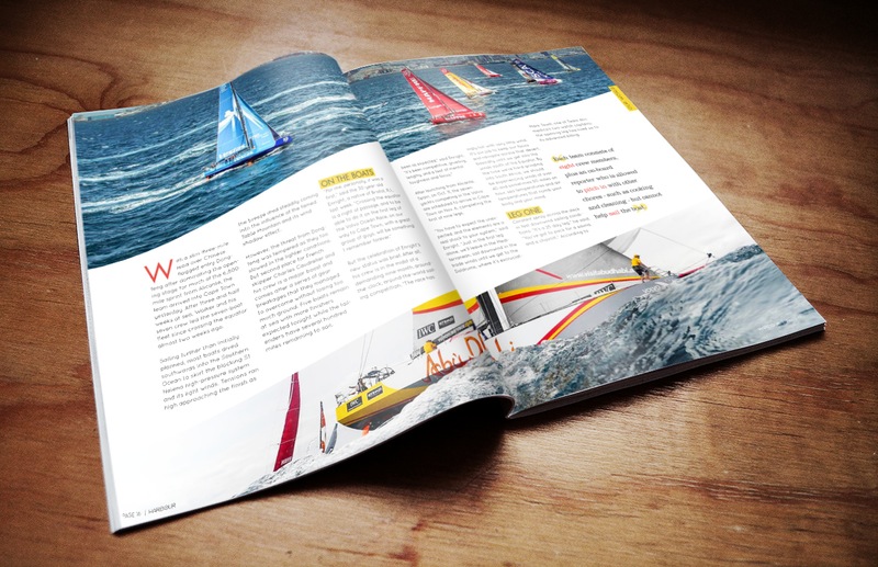
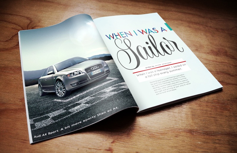
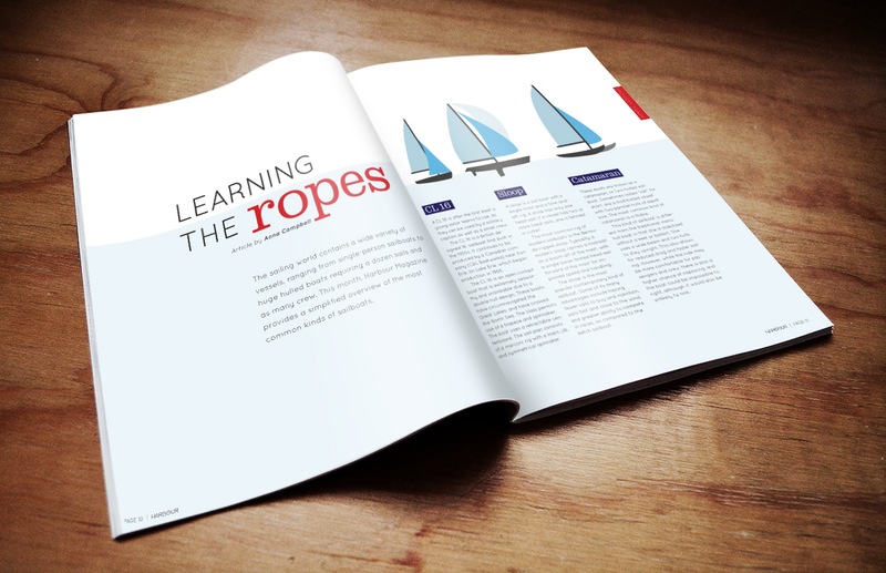
For this reason, I carefully chose and wrote three articles in the magazine. The first one is a story about growing up sailing on the brigs every summer, and the lessons that the author carried with her for the rest of her life. The second article I wrote and illustrated myself, providing an easy overview of the different kinds of sailboats, with a history and the modern usages of these boats. The third was a story and news combined, as it detailed the progress of the sailing teams competing in the Volvo Ocean Race, which was happening during the months I created this magazine. It occurs once every three years, and takes the sailors on a race all around the world, lasting eight months.
Another big problem I faced was learning how to adapt a print magazine to iPad design. Having never worked in this medium before, it was a big challenge, but one I was excited to learn about. Though print is what I am truly passionate about, this project showed me how interesting it can be to translate designs into an interactive environment. I created a fully functioning DPS version of the magazine, with buttons, slideshows, social media links, and more.
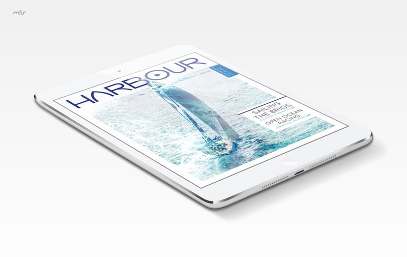
I think that the integration of a digital publishing version of the magazine is one of the ways this project addressed the original problem. Many people are now moving to digital as a way of getting news and information, so this was a good way to target a unique, younger audience. Through the mix of different kinds of information, but the overall clean, light design of the magazine, it shows the sailing world in a different light.
Through the process of making this magazine, I learned that the content must inform the design, instead of designing first and flowing articles in afterwards. I also learned about the intricacies of advertisement placement, magazine cover design, the process of creating vector illustrations, and gathering photographs for an article. This project ended up being one of the favourite things I have ever worked on. It was a wonderful experience to create a magazine start to finish, and it is an area I would love to work on again in my career.