The Brief
Create an information pamphlet and ipad publication highlighting a social issue
“A Dying Lake”, an information pamphlet and interactive IPad app, was a project I did in third year that draws together my interests in interaction design and information design. The project began with a research phase that established the scope, sources, and remedies of the chosen problem subject – harmful algal blooms (HAB’s) in Lake Erie – as well as an examination of who would be in a position to use this information to affect positive change, who would likely sponsor the publication, and who might be considered opposition to the changes that need to happen to solve the problem. The primary target was suburban homeowners, who might use fertilizer on their lawns, or may have pets (both of which contribute to the problem of algal blooms). For potential sponsors, I identified a number of different groups that might be interested in publishing this resource – conservation groups, tourism agencies, fishing industry – but ultimately decided on Ducks Unlimited, a conservation group with chapters both in Canada and the USA, and that focuses on environmental preservation for recreational usage, making it an ideal agent for representing various stakeholders in the Lake’s future. In terms of opposition, agricultural lobbyists were undoubtedly going to be a key antagonist, due to the massive contribution of agricultural run-off to the HAB problem.
The Challenge
Craft a narrative that encourages homeowners to reduce their phosphorus usage, while building social pressure on the agricultural lobby
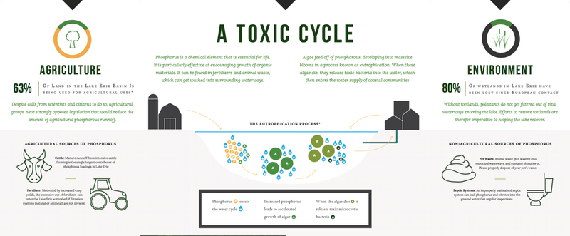
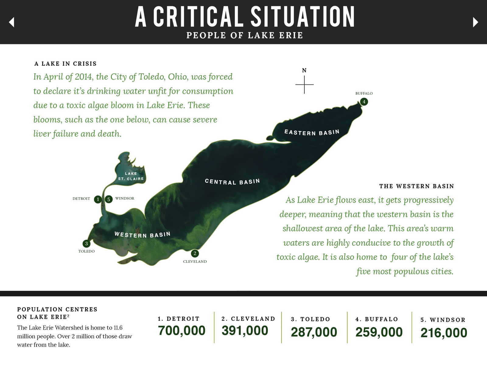
Based on the research, I started to construct a narrative that would engage the primary target to reconsider certain habits, while attempting to portray who the major culprits are in a negative light. The information graphic starts off by introducing the problem to the reader, and then examines the population centres on the lake, bringing home to the reader the kind of impact the issue has. Once the problem and it’s impact has been established, the narrative looks at all the different contributions to the problem, such as fertilizer runoff and animal waste, and how the average reader can reduce their own contribution to the problem. This is so that the reader can place themselves within the system, and see how their actions can have an effect.
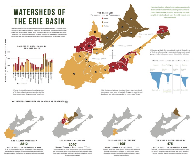
The final aspect of the narrative is a map of the lake’s various rivers, which reveal the sources of phosphorous runoff for each watershed. The watersheds that contribute the highest amount of phosphorous are highlighted below the main map, and the reader is struck by the fact that most of them are areas with high agricultural usage, with cattle also being a major source. The reader is thus able to identify who the major contributors are to issue at hand.
The Results
a publication that provides an easy to understand but informative narrative on how a variety of factors are destroying lake Erie.
The publication took the form of both a printed pamphlet and an ipad publication. In both cases I paid particular attention to how the reader interacts with the information and data. In the printed pamphlet, the more the user unfolds the pamphlet, the more detailed the information gets. In the ipad publication, the user can interact and explore with the information at their own discretion, giving them the ability to personalize their experience.