
Project Summary
While incorporating the strong visual icon of a rainbow, I designed an new identity for a hypothetical Toronto Pride Festival campaign through a poster that uses a illustrative style allowing for a controlled use of colour, thus exhibiting flamboyancy, pride, and celebration.
Contextualizing the Problem
What is it?
The Toronto Pride Festival (renamed the Rainbow Rights Festival) is an annual non-profit event taking place over the course of a week. This celebration is filled with events and opportunities ranging from educational public speaking gatherings covering topics that revolve around human rights and equality, to late night block parties that are sure to exceed one’s expectations in the flamboyancy and celebration categories. The primary goal of this event is to celebrate achievements humanity has made towards LGBT equality.
The identity design applied to the Toronto Pride Festival campaign must be diverse and capable of being applied across various print media at small and large sizes. It must also work on the web, acting as a theme for the Toronto Pride website. Lastly, promotional material must be made for the festival. The identity must be capable of creating visually appealing tee-shirt designs, stickers, hats, and other assorted goods.
Who is it for?
The target audience will be those who proudly support equal rights for the LGBT community. Younger age groups will come out with friends and families to participate in events and embrace the positive attitudes that overwhelm the streets. The older audience will do just the same but when the sun goes down and the nightlife comes out they’re dancing, drinking, dressing in drag and they begin to really let loose. The festival remains energetic and full of positive attitudes, it’s the perfect place for happy people to come together and celebrate with one another.
This audience can fall in any age group that is old enough to be educated on the facts of the LGBT struggle for equality. That being said, parents may also bring their children to the festival, there are activities appropriate for the whole family. The Rainbow Rights festival happily accepts people of any gender, age, and sexual orientation.
Why make this?
As a non-profit event, the Toronto Pride Festival has not been capable of contracting quality design work that lives up its reputation. A campaign is needed to develop a visual identity that matches the personality of the festival to better spread awareness of its causes and encourage attendance to it’s many events.
A note to make is that because the festival is non-profit, it should be understood that funding would not put forward money for spot colours or any specialized printing. A constraint is to stick to a strict CMYK colour scheme and assume that paper stock will not be of the highest quality.
My Process
The project began with the writing of a brief to outline the exact problem being approached. The brief included defining the target audience, stating deadlines, a background on the festival, outlining competitors, project specifications, and the new brand foundation and story.
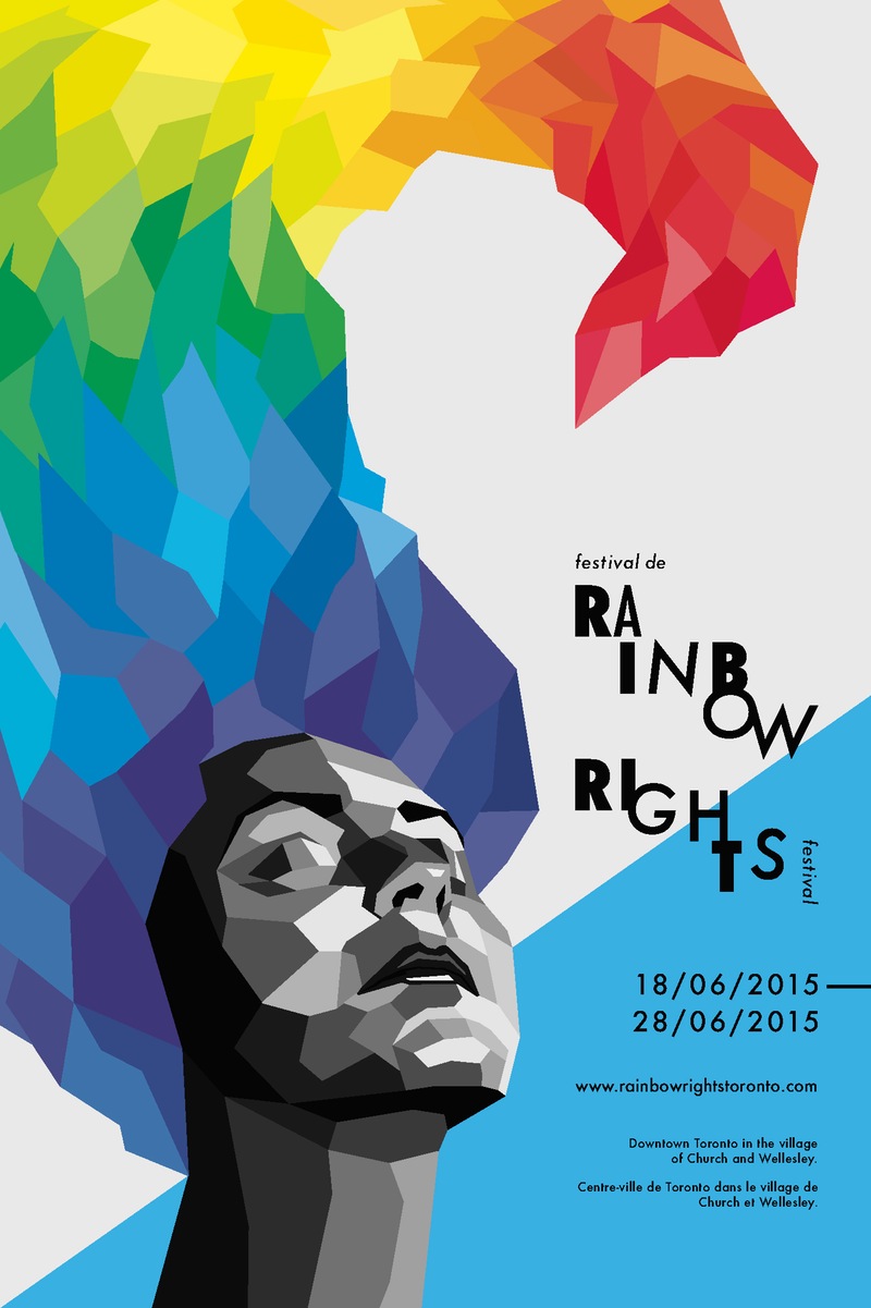
During the ideation process I became focused on the portrayal of flamboyancy, pride, and celebration. From my research I decided that by directing my work based off of these three keywords I would successfully be able to reach my target audience. I found it difficult to achieve this whilst also maintaining gender neutrality, as to avoid any misinterpretations regarding a gender bias.
To solve this problem I generated a gender neutral illustrative image of a persons head with their chin up signifying pride. The neutrality comes from the abstracted definition in the jaw line, vastly abstracted hair, and simplification of facial features.
Next I had to figure out how to achieve a controlled use of colour. I needed to use a rainbow in my colour palette, more importantly I needed to use the rainbow to maintain the seriousness of pride whilst also portraying flamboyancy and celebration.
To achieve the controlled use of colour I placed the majority of it in the persons hair. The shapes that create the hair resemble those found in the face and follow no pattern aside from restricting themselves to straight lines. I was able to render shapes with as many sides as I liked and place them where I desire, allowing for full control of the colour. The face remained black and white as to maintain a seriousness to the festival.
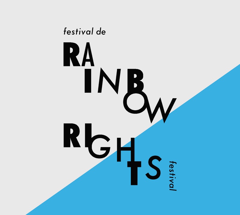
Another difficulty arose regarding the type treatment that was to be associated with the illustration. Typographically, I wanted to signify the idea of solidarity, people of all kinds coming together to celebrate as one.
To capture the idea of solidarity I rendered the header in multiple weights of Futura, avoiding a single baseline and using uneven tracking among the letters. Together this creates an odd combination of forms that harmonize with one another, all serve the same purpose of being
display type.
Solution
The generated imagery and type treatments found in this poster act as a strong basis for the rebrand of the Toronto Pride Festival. It captures themes of flamboyancy, pride and celebration whilst also containing an underlining theme of solidarity through the display type treatment.
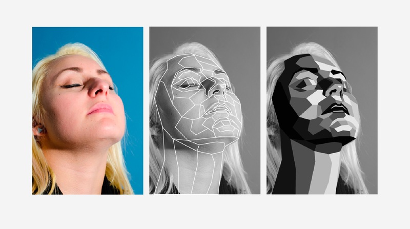
The Illustration
Though the final illustration is meant to be gender neutral, it originates from a woman face. I directed a friend of mine to hold a proud pose, chin up and eyes closed, while I took a photo. This photo was then traced in Adobe Illustrator. I followed the planes of the face and limited myself to the use of straight lines (inspired by WPAP Pop Art).
The Type
The display type went through an iterative process. It began with deciding upon a typeface that would harmonize well with the geometric feel of the illustration. Futura was chosen as it is a geometric typeface that works well at a broad range in scale, from the small to the very large. As I spelt out the new festival name “Rainbow Rights”, weights and forms of Futura were substituted letter by letter in the lines of text until a pleasant composition was achieved.