Knowing nuts can be messy when cracked open, I created a clean and simple way to dispose the broken shells from any nut. The shattered nut shells pile up when snacked on but have no place to toss the excess shells, there is an understandable wishing to improve the usability of the package. Most times snackers are forgetful to grab a toss bucket, so why not design and incorporate both the container and toss bucket with no extra hassle. While this seemed like such a efficient idea, it was a challenge I was willing to take on.
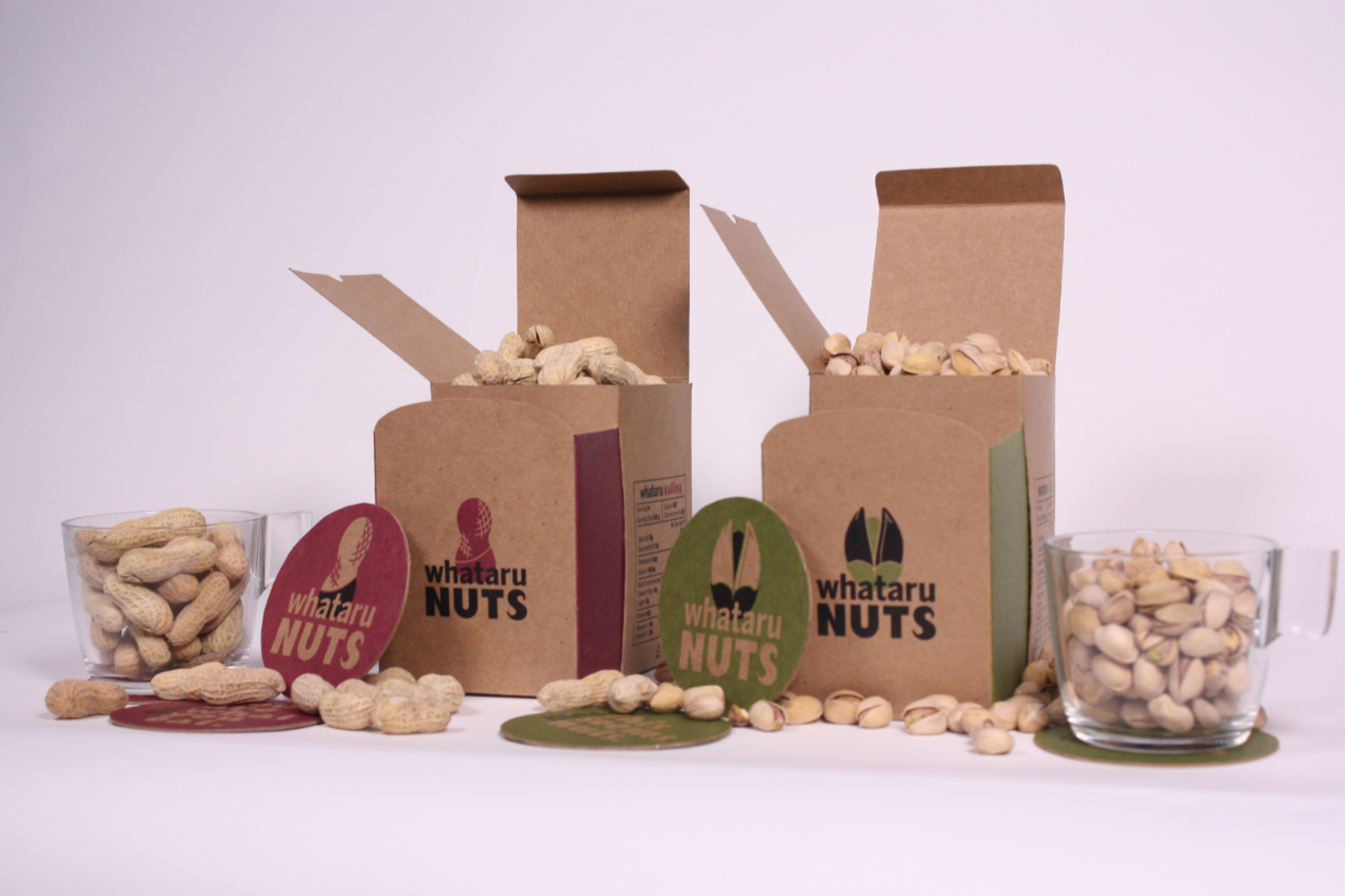
For this challenge I focussed on two different shapes of shelled nuts, peanuts and pistachios. I believe the package design is telling a narrative in every detail. From the playful type treatment and fun colour scheme, to the shape and opening mechanism, is an abstract reference to peanuts and pistachios themselves. The final result is a package where the inside space holds either the shelled peanuts or pistachios and the outer layer pulls a hidden tray outwards and becomes a separate compartment to home the cracked shells- a perfect and efficient way to enjoy both nuts instantly mess free.
The graphics are no less important for the solution. The main intention was to create graphics that depict the shape of peanuts or pistachios, that is where the playful sizing of type treatment comes in. Also, to think even further about the consumers, all the nutrition facts are shown on the side panel where the consumer would place their hand. Playing off the title “Whataru Eating” design makes this essential information visually appealing and much more interesting to look at.
An important part during the thought process was to focus on user experience and second function of the package. The main challenge was to create an easy to use package to house the nuts and incorporate the secondary use, acting trash can. At first, I designed to have the trash can act like a draw-bridge on the outside of the package. It seemed like it was useable until the user interacts with the package. The sides of the trash can stick out and interrupt with the overall experience of the package.
I challenged myself to incorporate the trash can on the inside of the package, hiding all the engineering. The way the trash can slides out catches on to the bottom of the outer layer so it does not slide out all the way, and gives the consumer to open and close the acting trash can.
This packaging offers a solution to the problem of homing the empty shells of both peanuts or pistachios, thanks to a secondary component that acts like a trash can. The techniques for sustainable graphic design include: reducing the amount of materials required for production, using paper and material made made with recycled, post-consumer waste, and printing at low-VOC inks. The package is made out of recycled paper and can be recycled again and uses a minimum of glue which is friendly for the environment.
And who does not like to enjoy a cold brewed beer with their salted nuts, the packages come with 4 whimsical coasters, adding to the overall experience of
Whataru Nuts packaging.