How can gratitude and selflessness be expressed to foster kindness?
The initial research started in mental health — more specifically, how the adversities we face as a child linger on us through adulthood, often quietly damaging our mental health along the way. Looking more in depth, arose solutions on how heal from our struggles: practising meditation, self-compassion, gratitude and generosity. Focusing on the later two techniques, this project sought to communicate gratitude and generosity at a larger scale by sharing the exercise with the public in a way that everyone can relate.
I was really inspired by social experiments and movements such as:
Emotion Revolution https://www.youtube.com/watch?v=wQdcCiVb59g
Just the little things http://justlittlethings.net/
100 days of rejection http://fearbuster.com/100-
I found these projects heartwarming and real. I was also inspired by many self-help journals and posters. Motivated, I wanted to promote self worth and kindness.
My original sketches led up to do a book. Similar to a book of quotes, there would be one task of kindness per page for someone to do each day. The flaw of seeing all the tasks at once brought set backs to why someone would be motivated to complete the whole book.
I looked into design books and came across some calendar designs. I was influenced by the systems of organizing dates — I saw many rows, dots, and colour was used strategically. I saw some scratch and save approaches and thought that might be effective for my concept.
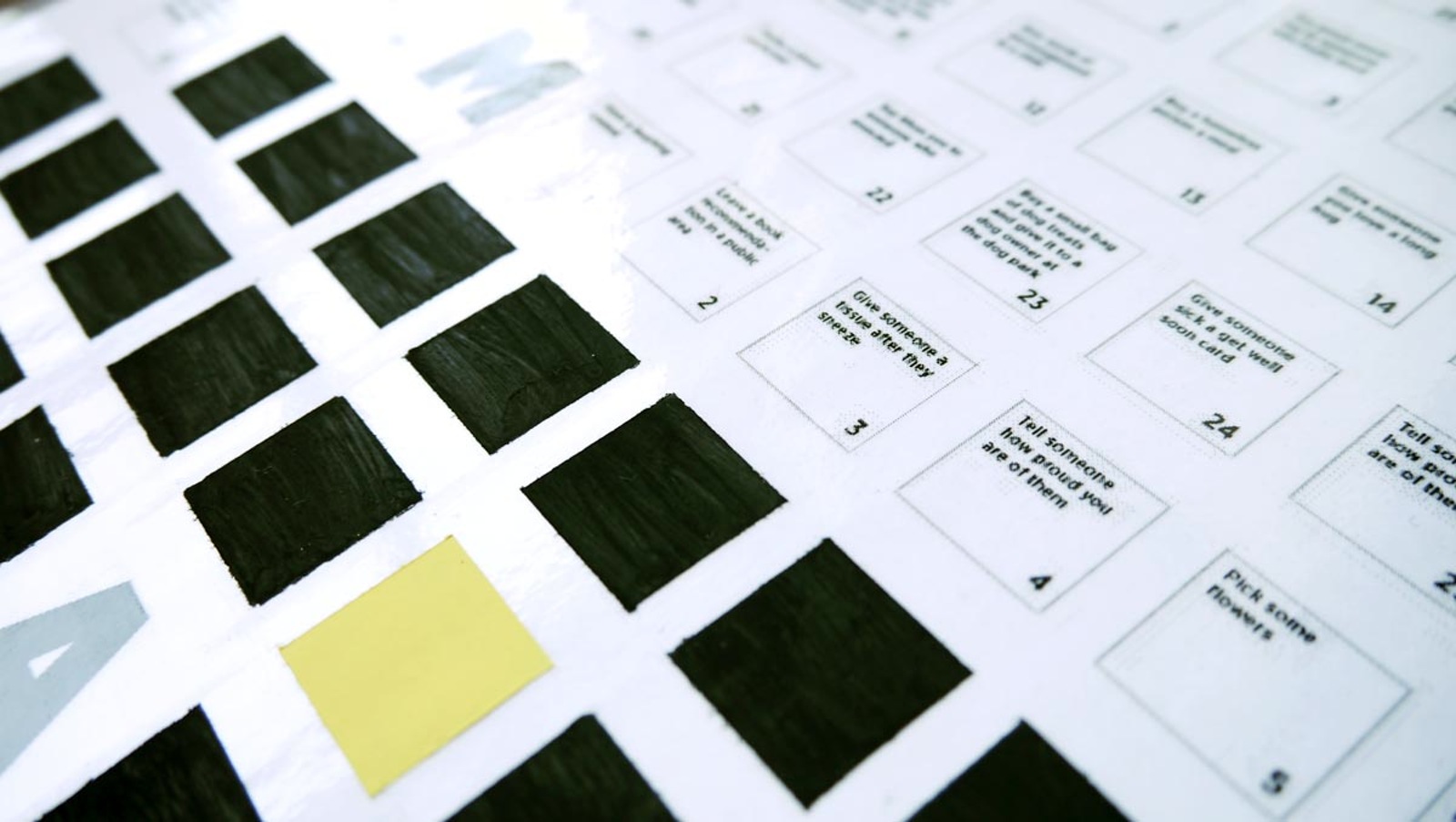
I created 365 tasks to fill a year and added the data into a poster calendar. Such examples are:
Arrange a surprise pizza delivery for a friend, make a loved one a cup of tea and buy a gift card to the spa and give it to a mom on the street.
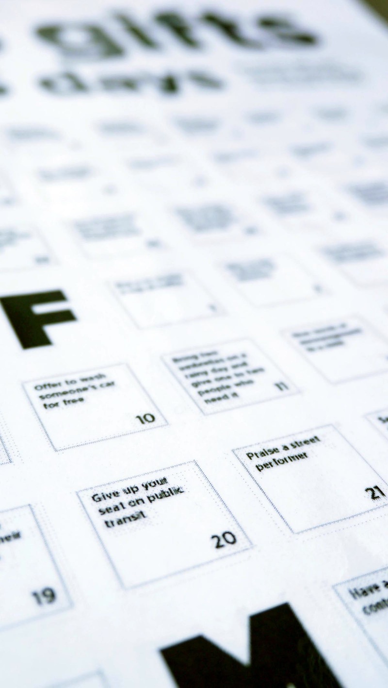
I kept in mind the seasons and organized the tasks to correlate with certain holidays.
I did some tests with paint and dish soap for the scratch and save, and it works! I considered using tape for the scratch and save but laminating the poster was more efficient.
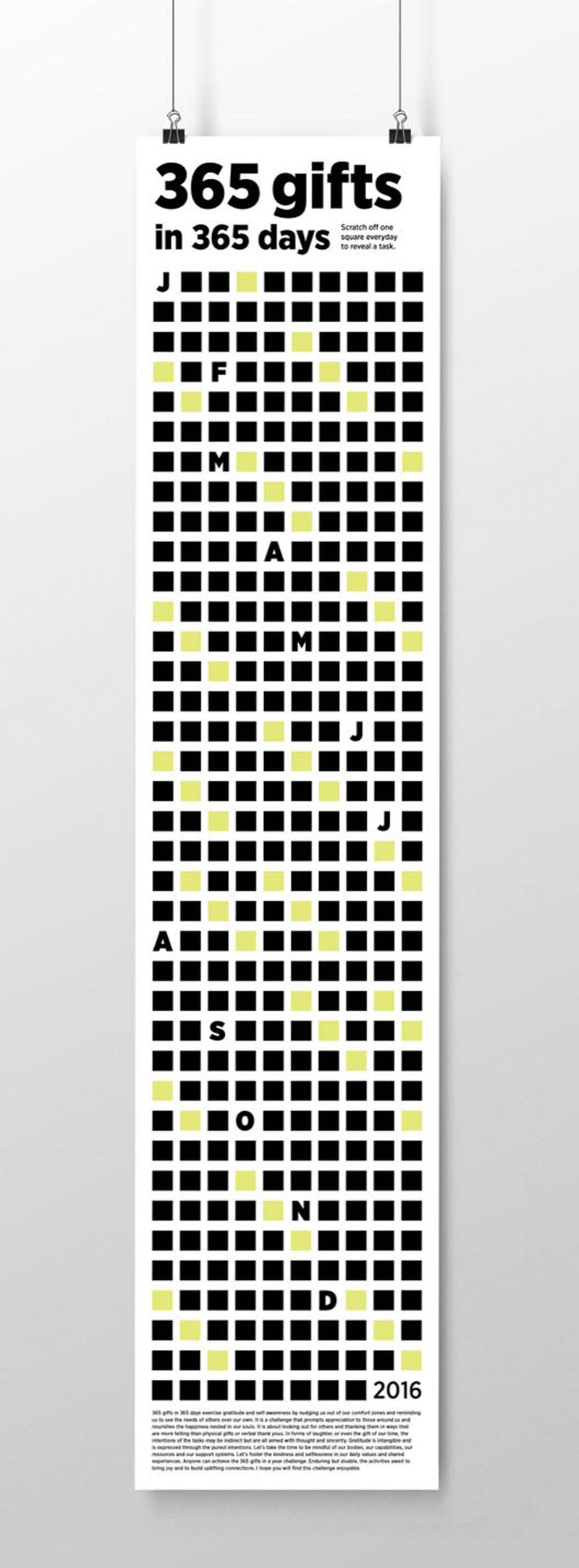
I wanted the poster to look clean and minimal. Hence, I chose a sans serif typeface and using the squares as a visual element. I experimented with different colours and motifs for the squares, but I found that black squares with pops of yellow is most graphic. I designed the poster to be narrow so it can be hung behind a door.
Challenges came with dealing with such a large mass squares — I had to build a methodical system to keep track of all the data and in aligning all the squares accurately in the painting process. Also, the fact that painting individual squares is not as easy as I thought it would be. Using painter’s tape, I had to measure the tape, cut, align it to the rows, paint, let dry, paint again, remove tape. Unfortunately, the paint seeped under some of the tape, so I used a coin to clean up the squares individually. Lastly, I used tape to “pick up” the debris as the paint sticks onto the poster. Take away: measure, measure, be patient, measure again!
The final reveal
356 gifts in 365 days is a fun scratch and save poster calendar that promotes the act of giving. Doable for anyone, it is about exercising self-awareness by reminding us to see the needs of others over our own and thanking them in ways that are more telling than physical gifts or verbal thank yous. I really enjoyed making it. There are still some details I would like to add (another series and a sticker surprise) so, there is more to come!