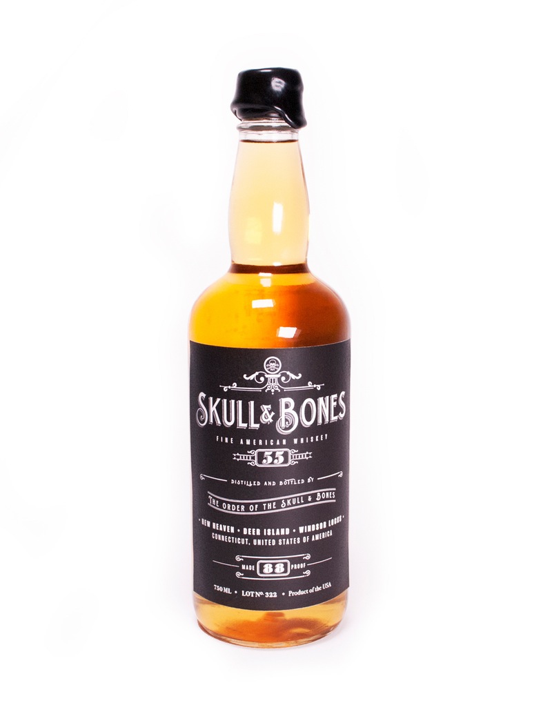
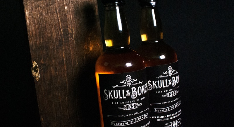
The idea for this project was to create a branded premium whiskey that reflected the secretive nature of the Skull & Bones society. The objective was to immerse the user in activities that both go with drinking, but could possibly take place within the confines of the society’s meetings. Creating a set of items that included cards, a seal with wax and four coasters was designed to accommodate a party of four (often a number required to play poker, and to reflect what would be considered a gathering in the society). Overall my goal was to replicate the feel of being inducted into a secret society, while still creating a kit centralized around whiskey. It is made to be a premium, sophisticated brand for the dedicated whiskey connoisseur, demonstrating its luxury through the limited colour pallet of gold, black and white.
Making the Logotype
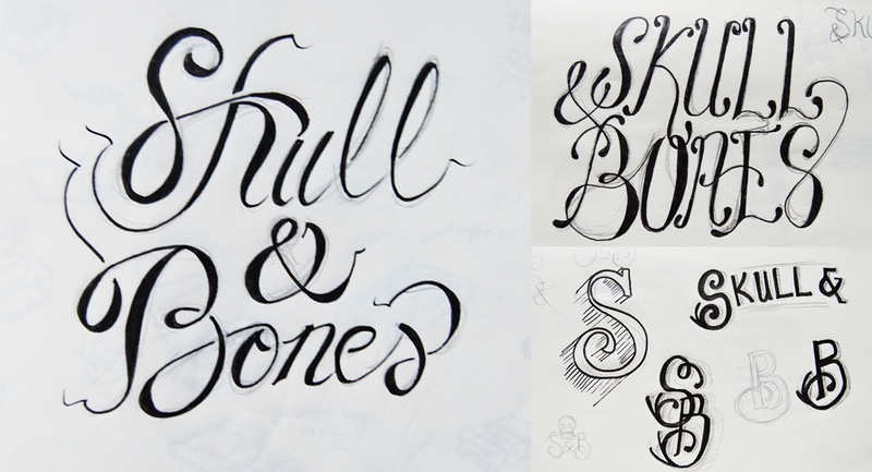
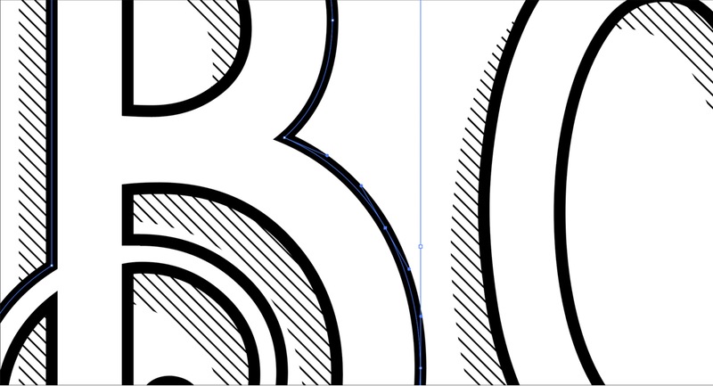
The first requirement of the project was to create a unique typographic logo. The logotype had to be iconic, harking back to classic techniques with a flowing yet still solid style. Stylized off other storied Whiskey brands like Johnnie Walker and Jack Daniels, the type had to stand out in a black and white brand, so it had to be memorable and bold. In the end I decided to use an existing typeface with heavy modifications to achieve the desired look.
Creating the Package
Perhaps the most difficult part of the process was creating the final packaging for the container. I decided to create a wooden box, shaped in the essence of a coffin, to hold the contents of the kit. The box was manufactured with a cedar board, to emulate the body of the Whiskey, smooth and ashy. Cut using a laser cutter (making the box have burnt edges, again, to go with the flavour of the Whiskey), the box features the main logo mark of the brand, a skull and crossbones medallion on it’s front door. The box also swings open, giving more to it’s illusion as a coffin, making it a great alcohol showpiece as well as a premium product.
Creating an Experience
The objective of Skull & Bones was to provide an experience for the product. Not only was it supposed to be a premium Whiskey brand, but it was also made to emulate an experience in a secret society. The contents of the packaging were made so that it would be easy for a group of friends to get together in secret, and drink the night away. It was designed with an air of exclusivity, made to drive home the premium nature of the brand.
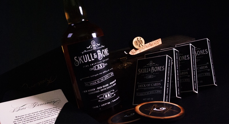
The box contains many items needed for a night of revelry. Inside is a wax stamp and seal kit, for sending those hushed messages with a Skull & Bones branded seal. A deck of cards, for your friends to practice their poker face .A set of coasters, so as not to get your antique tables wet, and the bottle itself, smooth and bold, with secret undertones begging you to explore deeper.Also included is a letter, inviting you to your first meeting.
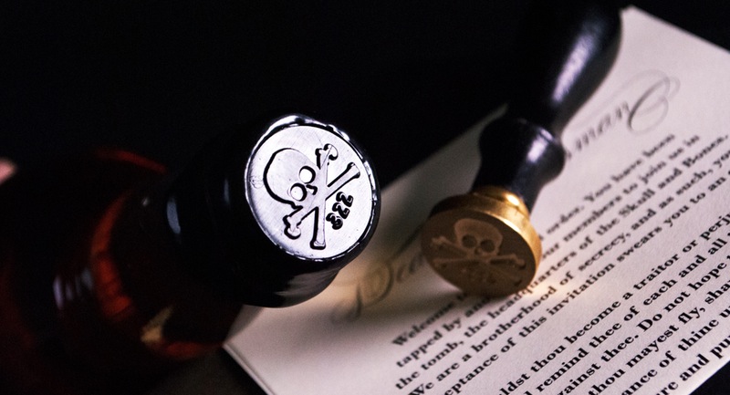
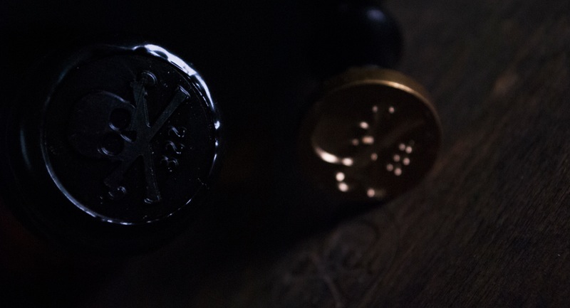
Perhaps the most iconic image is that of the wax seal applied to the top of the box. The seal embodies the brand, vintage, but a premium product, reminiscent of the golden age of secret societies.