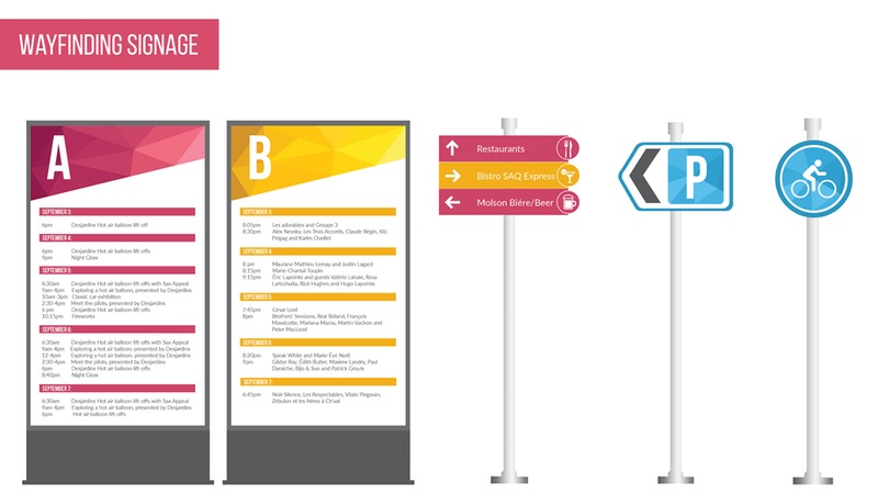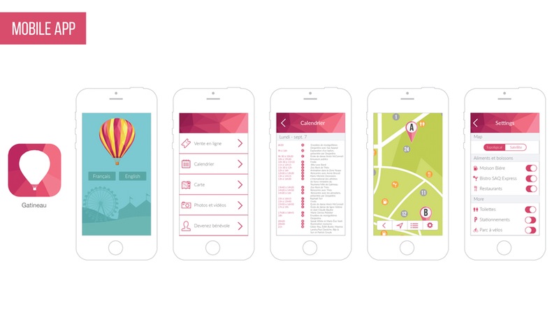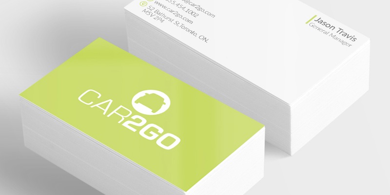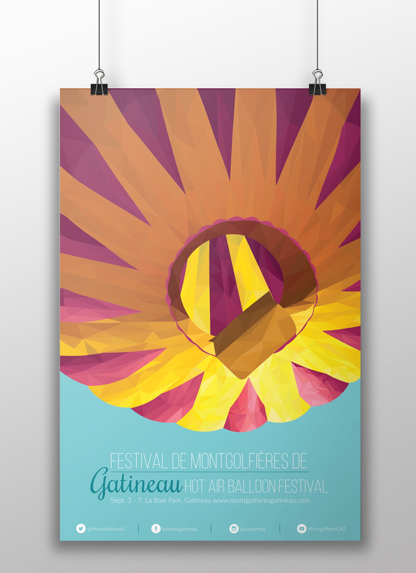
The project that I’m most proud of is the rebranding of the Gatineau Hot Air Balloon Festival. Rebranding this festival and designing a whole system was challenging because it had to appeal to people of all ages, but I was able to achieve that by using colours and compositions that reflected the essence of the festival.
The Gatineau Hot Air Balloon Festival takes place in Quebec once a year during the Labor Day weekend in September. The length of the festival changes every year depending on the weather and other factors but it usually lasts from five to seven days. This Festival started in 1988 with the main purpose of giving the City of Gatineau a major tourist and family event.
This past year the Gatineau Hot Air Balloon Festival celebrated its 28th edition. With nearly 300 shows which include sporting activities, competitions, fireworks, concerts, and amusement rides, this festival offers something for people of all ages to enjoy. Since the festival first started it has grown a lot and it is now the fifth largest hot air balloon gathering in the world and first in Canada, drawing a crowd of over 200,000 visitors every year.
After doing this research about the festival and looking at the previous posters and other forms of advertisement that they have had, I noticed that most of the posters didn’t reflect the essence of the festival and didn’t have much unity. Looking at the previous promotional material helped me have a better idea of which design elements I needed to improve or change and which design elements I needed to keep.
I started my design process by finding words that reflected the essence of the festival and inspired me to move forward with the concept brainstorming; some of the words that inspired me were: joy, family, excitement, childhood and summer. Having those words as inspiration helped me decide which colour palette was appropriate for the festival and those words also gave me the starting point for the poster’s compositions.
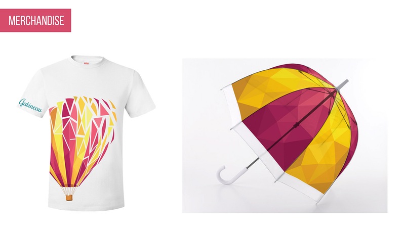
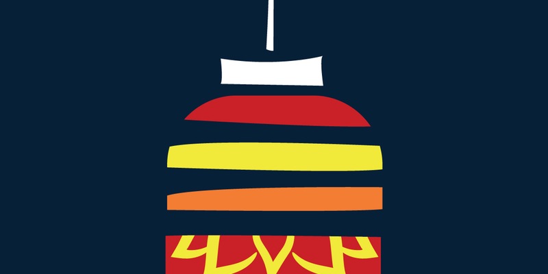
Since the goal was to create a poster and overall system that reflected the essence of the festival, I decided to use a hot air balloon as part of all the promotional items, but to give it some variation through the different promotional items, I decided to show it from different angles instead of having the typical front view of the balloon.

Once I decided how I wanted the compositions to look like, it was time to decide which medium I wanted to use to create these compositions. During my experimental process I used watercolours, origami, normal illustrations, and I also used the polygon vector technique to create an illustration with a photo-realistic effect. At the end I decided to go with the polygon vector technique because it had a very interesting look to it.
At the end I was very happy with how this project turned out since I was able to accomplish my goal of creating unity; this was achieved by using the same colour palette and also by using the polygon technique all throughout the system. I was also able to create a good balance of unity and variety by showing the balloon from a different perspective in each promotional item.
