When tasked with creating a booklet that represents a Canadian artist, illustrators were mentioned. I immediately thought of Barbara Reid, and how fun it could be to represent her style. As a young kid roaming through the library, Barbara Reid was one of my favourites. Pictures were my main focus at that age, as my reading skills weren’t fully developed, so I came to love her work. Her illustrations brought a story to life, with enchanting textures and dimension. To this day her images captivate me, because plasticine seems simple and juvenile, yet the images she creates are complex and intricate. Her use of plasticine makes the images jump off the page, giving the urge to touch the page as if the actual plasticine sits upon the paper.
My personal style is fluid, and to ensure that I don’t get pigeonholed I actively take on projects with a variety of styles. I chose to capture Barbara Reid not only for her distinct and interesting styles, but also because of her fine art techniques. My fine art skills are weak, and working with Barbara Reid’s style proved to be both fun and challenging.
I designed this booklet as a printed synopsis of Barbara Reid’s website barbarareid.ca. It represents her works, style, and narrative in a very static form. Her website has updated in design since I originally created this piece, and is overly simplified in a gallery-style manner, the actual content remains the same. The original site included a plasticine header, and featured her typography work whenever possible. It was covered in ladybugs and caterpillars, greeting you on every page.
My first step in creating this booklet was to mimic her techniques. Using her video tutorials online, I created the piece that is featured on the front and back covers of the booklet. This grassy landscape of ladybugs helped me understand her style beyond the medium, recognizing her use of rounded shapes, stark colour contrasts, and smearing techniques. Creating the ladybugs I also observed the personality behind these plasticine
As she has so many beautiful pieces, I chose one to feature on each spread. These images were not just for aesthetics, but solidified the message portrayed throughout the text.
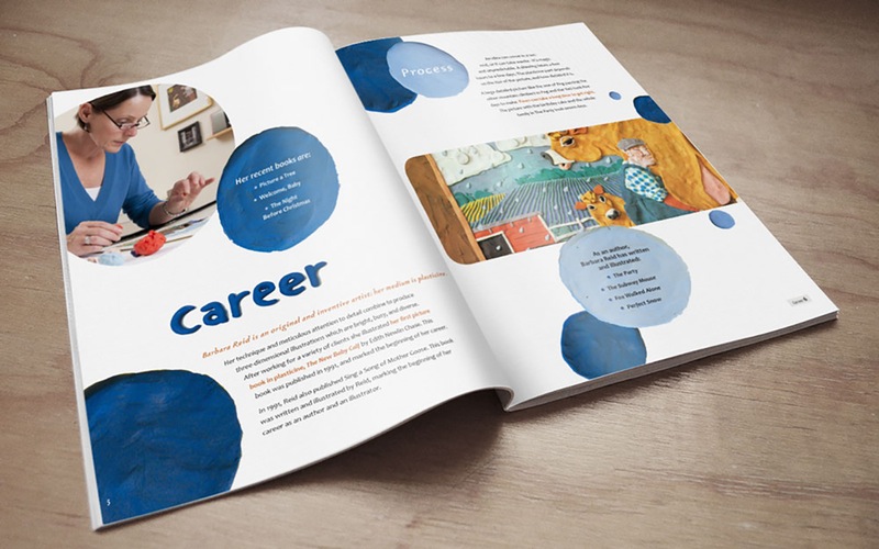
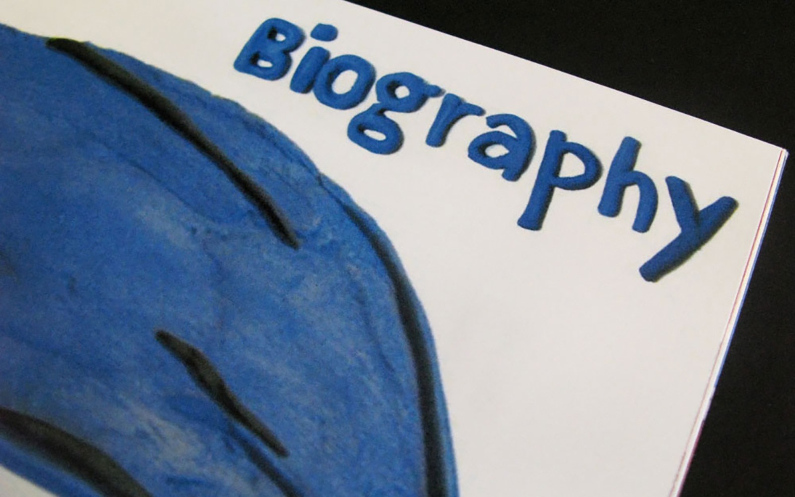
The headings for each spread were also created after carefully studying her style. I based them off of Candara, which was used for my body copy. The letterforms flow nicely, and have a bubbly personality. Being spacious it also allowed an immortalization in plasticine that was legible. The highlighted quotes and introductory sentences are in Garamont, a font that she uses heavily in her own books. The greatest challenge with the design of this piece was remaining true to Barbara Reid’s style. This booklet is not a gallery of her works, but a story of how she became an iconic Canadian illustrator.