Introduction
The Muskoka Song Music Festival is a Canadian festival in its inaugural year. The goal for this project was to help promote this festival so that it can become a well-established music festival in the live music industry. Through brand and identity development, my hopes were that people would be able to recognize Muskoka Song as a notable event. Because this is such a new festival, the goal of this project was to create an identity the immediately makes people think of Muskoka and the culture surrounding the festival.
Deliverables
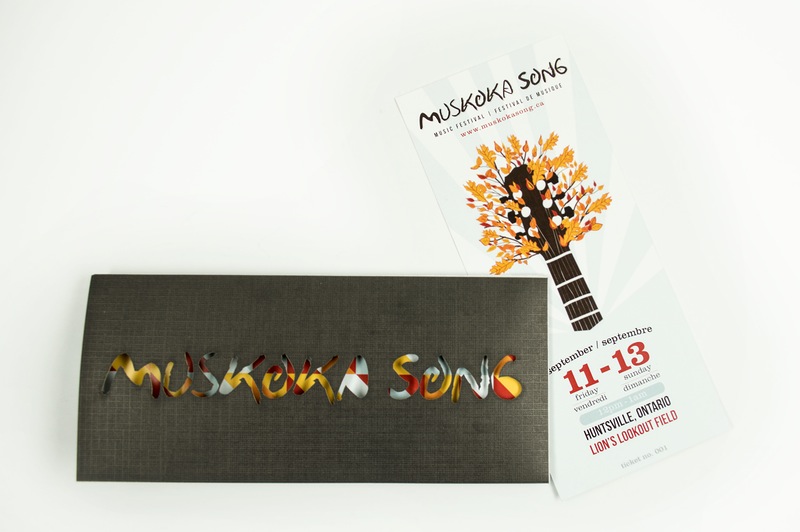
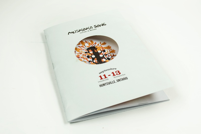
The task of creating a brand identity for an entire music festival is a large undertaking. For the purposes of this project, I focused on designing three main elements that would contribute to the overall festival. Festival posters, tickets and brochures would not only contribute to the overall brand of the festival, but they are also all very useful tools to help make the festival experience an enjoyable one for the attendees. Determining who the attendees would be in order to learn about our target audience was step one towards reaching our goal. This was done through research and learning about the goals of the festival itself and gaining an understanding of the surroundings of the festival.
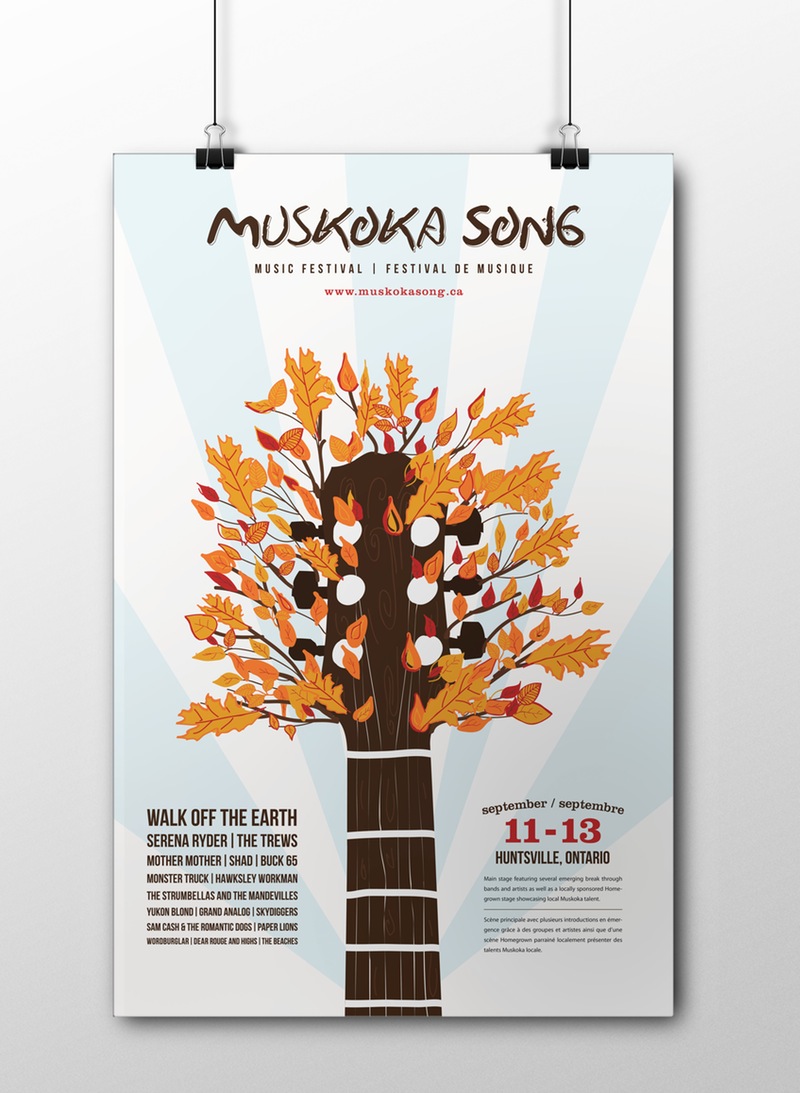
Poster
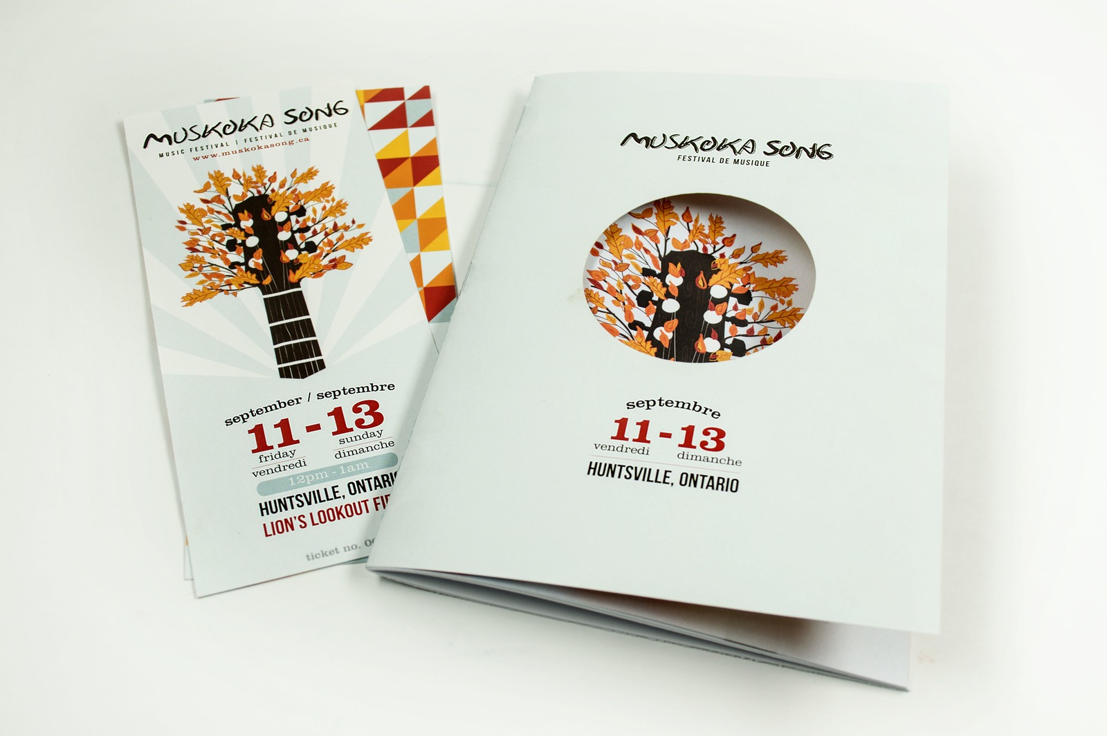
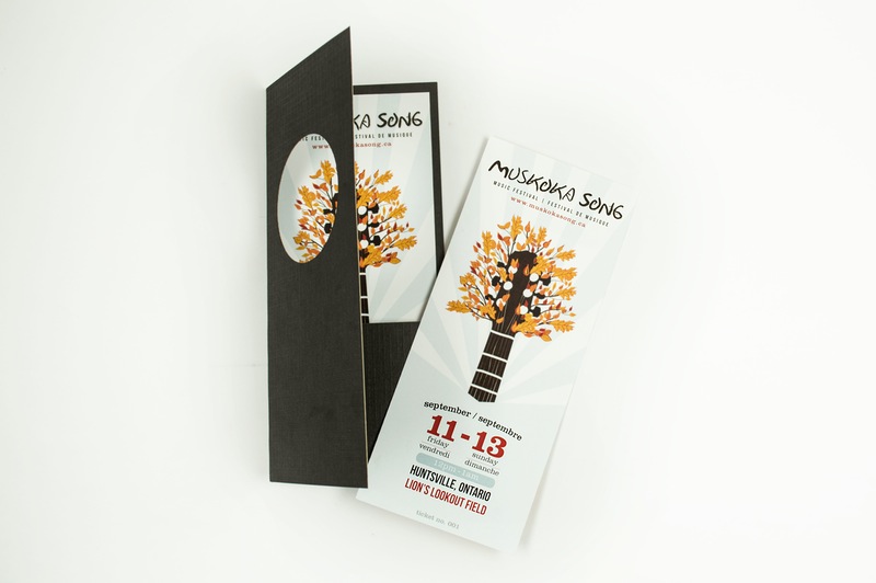
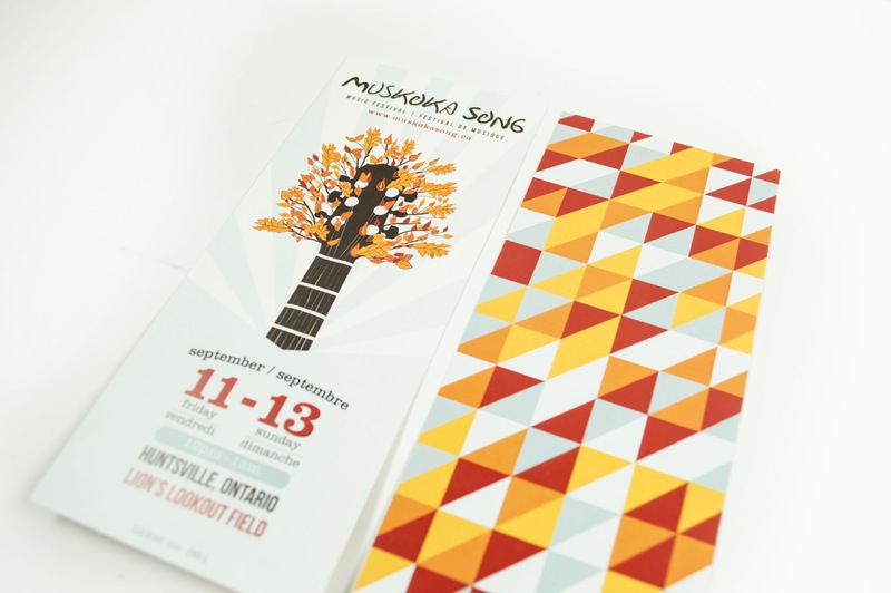
Ticket
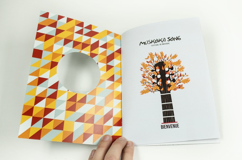
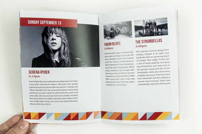
Program
Target Audience
The region of Muskoka has a very rich background as it is one of Canada’s most unique and stunning travel destinations for people all around the world. Muskoka attracts the outdoorsy people who enjoy camping and being outside, which contributes to the target audience for this project. Muskoka Song is unique in the sense that it is located right in the middle of a natural environment with a stunning backdrop of rocks, lakes and trees. This focus on the environment is also one of the main reasons why Muskoka Song is committed to running this festival as environmentally friendly as possible by establishing several green initiatives. The target age group for Muskoka Song would mostly be young adults and teenagers, based on the artists that would be performing at the festival. Muskoka Song has, however, taken several initiatives to make the festival family-friendly, which means that the visual language for the festival needed to be inviting for younger children, but also intriguing to a more mature audience as well.
My Process
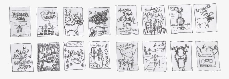
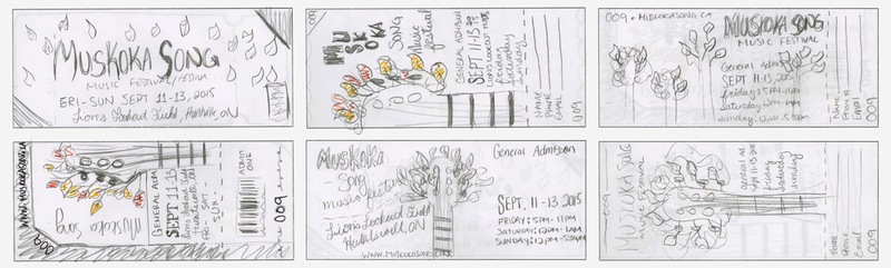
Given all this information, my task was then to create a visual system that accomplishes the goals of the project and showcases the festival in a way that is true to their vision. I started off by creating mood boards, followed by sketches as part of the process for designing the poster, which was the first deliverable for the project. Once the poster was in place, the other two deliverables could be made using the established design system. The approach for the branding identity ended up being an illustration of a guitar neck that turns into a colourful fall tree. Essence words for this identity could be lively, exciting and natural. It works for the two target audiences; young adult music lovers, and families. This works because even though it is illustration based, it does not come across as being an event exclusively for children. Muskoka Song is held in the fall, which is well represented by the bright orange, yellow and red leaves in the tree. I wanted the audience to feel alive, excited and fulfilled when they see the posters and when they go to the actual event. The bright colours help to convey this message.
Summary
Overall, I feel this project was a good representation of how the design process might work in the industry when branding an actual festival. There were certain challenges that I had to overcome in order to meet the needs of the client. For example, being a Canadian festival required that the system of elements be bilingual. Designing with spot colour treatment was also something that I had the opportunity to explore with this project. I feel that being able to design a consistent system and apply it to several different elements was a challenge in itself, which is one of the key things I learned throughout the process of this project.