
The aim of this project was to give the Hassle Free Clinic a branding that better reflects their personality and philosophy. The clinic places high importance on welcoming everybody from all walks of life. Most of the services provided by the clinic are free to make sure that treatment is accessible to all. The clinic aims to make people of all orientations, races, ages etc. to feel welcome. In creating the new branding I found that a problem that clinics in general including Hassle Free have are being intimidating which means that some people will not try to get the help that they may need. I worked on making the clinic feel friendly and welcoming to all. The Hassle Free sexual health clinic is focused on community and providing sexual health services both, medical and counselling to all who need it. All through the history of the clinic the organization has tried to help fight for different laws to be put in place for the improvement of sexual health treatment in Ontario. This includes in the mid-80s the effort made to get anonymous HIV testing in Canada. Thus, showing the importance of providing the best service possible to those who need it.
When beginning the project I researched the clinic and other clinics to understand what their problems were and what I could improve upon; as well, to identify the target demographic. I found that one problem is that the majority had a very serious tone that young adults tend to reject. Another problem I recognized was that most of the clinics were not appealing to their target audience which tends to be young adults. What was separating them from their audience was that most clinics I found did not have a strong online presence. When targeting to a younger group, they often look to the internet to find out information and thus, this was an area that I decided to work on. One struggle I came across in trying to fix these problems was to maintain an approach that showed that the clinic is professional and deal with serious problems while not coming off as too strict and serious.
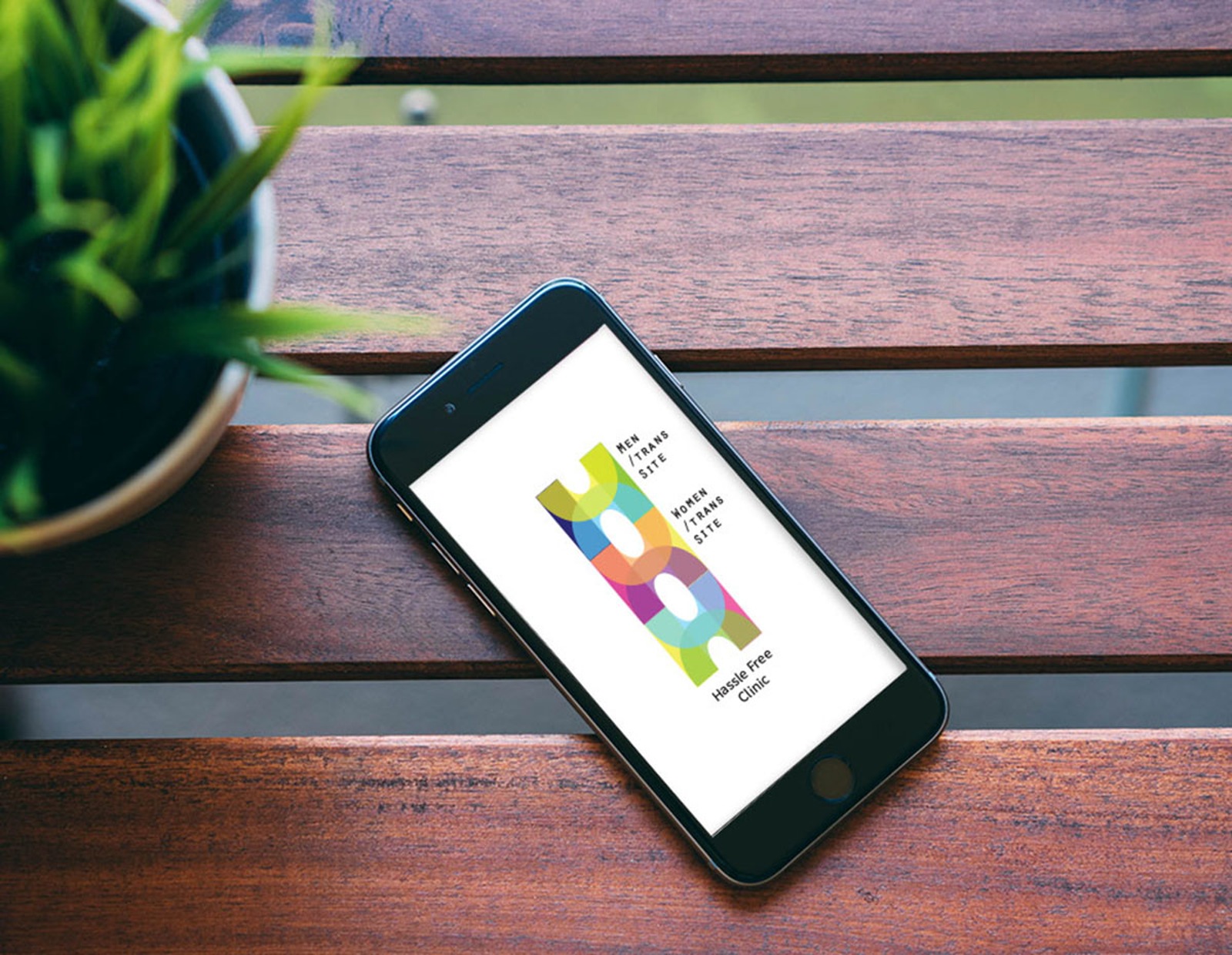
In the new corporate identity of the Hassle Free Clinic more of the modern, open-mindedness of the clinic is reflected. The identity was also intended to reflect the actual meaning of the name hassle free which is associated with being easy to use, fast, problem free and simple. This is created by using basic primary colours and shapes to create the logo and the simple visual style of the brand. The clinic attracts a high ratio of adults in their 20s and to cater to this the branding is bright and fun. Although safe sex and sexual health treatment is a serious matter it does not need to be too dull or boring. The identity of the brand remains professional as it is designed to be simple and polished with hints of colour to balance the welcoming attitude and the seriousness needed for a health institution. As going to a sexual health clinic can be intimidating for some people creating an appearance that is friendly and approachable helps customers to come in and use these services that are so important to their health. This visual strategy balancew a sleek and simple approach with a colourful and pleasant appearance.
One key distinguisher of the clinic from others is that there are separate hours for men and women (people that identify as trans can go to which ever they are more comfortable with). This separation allows everyone to be seen and provides a more comfortable environment for those coming in. The new identity uses different dynamic logos to represent the separation of women/trans and men/trans hours that are offered in the clinic. These different logos make it simple for users to see how the clinic is set up and find the right services for themselves.
The main logo showing colours that are tied to both genders (pink and blue) and other colours tied to neither (yellow and green) attempts to reflect it is the umbrella of both the women, men and trans services and that it is inclusive of everyone. One of the key elements of the clinic’s philosophy is to provide non-judgemental service to all kinds of people especially marginalized communities. The circular forms that intersect in the logo show the intersection of groups in the community and forming an inclusive space.