You’re invited to

The Intermission: Grad Show

When

Tuesday, April 19, 2016

Industry Reception

4:30pm—7pm

Doors Open

7pm—11pm

Where

The Liberty Grand

25 British Columbia Rd, Toronto

The Intermission is the 2016 York/Sheridan Program in Design’s annual showcase of the best work produced by its graduating class. It is a night for the industry to connect with emerging designers and explore their works, and for students to celebrate their past four years of hard work with you!

Getting to the Show

Getting to the Show

TTC
29 Dufferin → Saskatchewan Rd
504 King → Dufferin St
509 Harbourfront → Manitoba Dr
GO
Lakeshore West → Exhibition
Get directions on Google Maps

Frequently Asked Questions

Is the show free?

Yes, absolutely. However, we do help fund the event through sponsorships. If you’re interested in supporting this or future years, get in touch.

What can I expect to see and do at the show?

The show is an opportunity to browse the work and meet in-person with grads from one of Canada’s top design programs.

Will there be drinks?

Yes, we’ll have a cash bar available throughout the night.

What is the 'Industry Reception' portion of the show?

We dedicate a part of the night exclusively to people working in the design and creative industries. All students will be there to answer any questions about their work and experience. No ticket or registration is required.

I'll be at FITC on April 19th. Can I still come?

Definitely! The FITC schedule ends at 6pm on April 19th. We’re open until 11pm, so there’s lots of time if you’d like to swing by in the evening.

Where can I park my car?

There is a parking area located beside the Liberty Grand that will be available.

Come Meet the Cast!

Let us know if you're coming on Facebook and add the event to your calendar. We hope to see you there!

Grad Show Liberty Grand, TorontoApril 19
View Event Details
View Full Site
View Event Details
Menu
View Full Site
Package Design
Crunchy Cravings

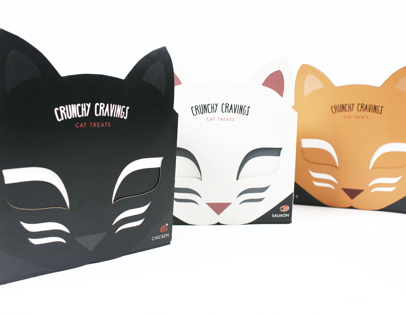
Working within the limitations of paper, I designed a package for cat treats that would be fun and engaging for the target audience.
I had noticed that most (if not all) cat treats came in plasticre-sealablebaggies, with a happy, jumping cat featured next to the brand. As much as this solution is practical, it is also harmful for the environment as it cannot be recycled. Not only that, but because every
brand features the same format, they all blend in with oneanother—there isn’t one that stands out from the crowd.
I approached this project with the intention of making something unique and engaging for cat owners. I began by compiling a document of inspiringimages—container shapes, colours, materials, brands, packages and illustration styles that caught my eye. Through this exploration I decided that I wanted to use a cat’s face as my main focus, so I compiled some more images catering towards that. Looking through my inspiration, I began designing my own iconic cat face, taking inspirational elements and making them my own. When I had a rough idea of what it would look like, I started building my initial prototypes. These were very basic and made out of flimsy paper, but were enough to give me a sense of what worked and what didn’t. The second prototype, which was inspired by the PEZ candy containers, seemed less practical than the first one. The first one gave me the option of playing with the eyes as the box opened and closed, and thus had more potential to succeed so I settled on that shape.

I then moved on to brainstorming possible names for the brand. Here are some that I came up with: Joyful Kitty, active cat, yummy cat food, happy surprise, cat cravings, purrfect delights, cat munchies, and crunchy cravings. “Crunchy Cravings” described the texture of the treats as well as their addictiveness in a nice and catchy way. I proceeded to play around with different typefaces and arrangements that would work with my selected prototype.
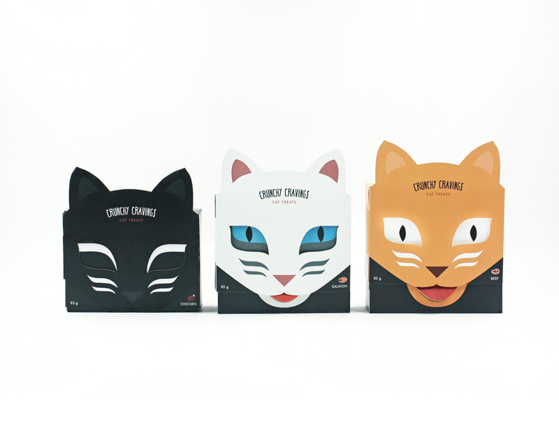
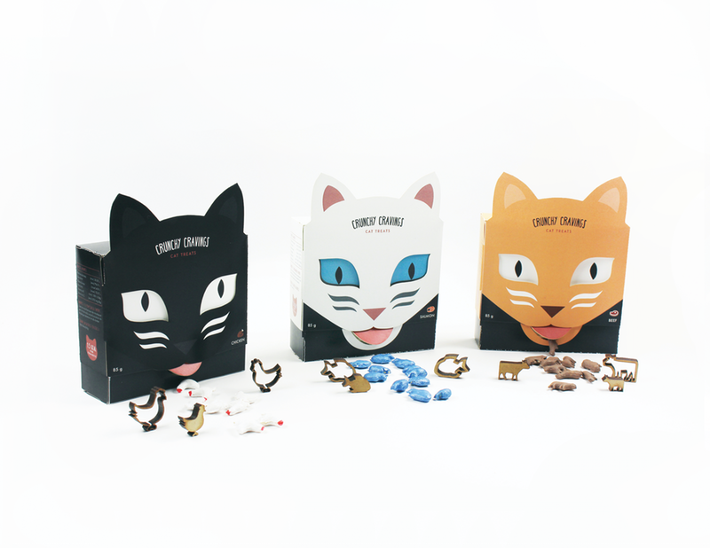
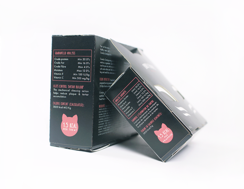
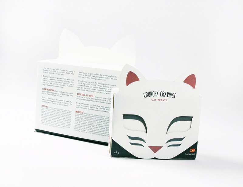
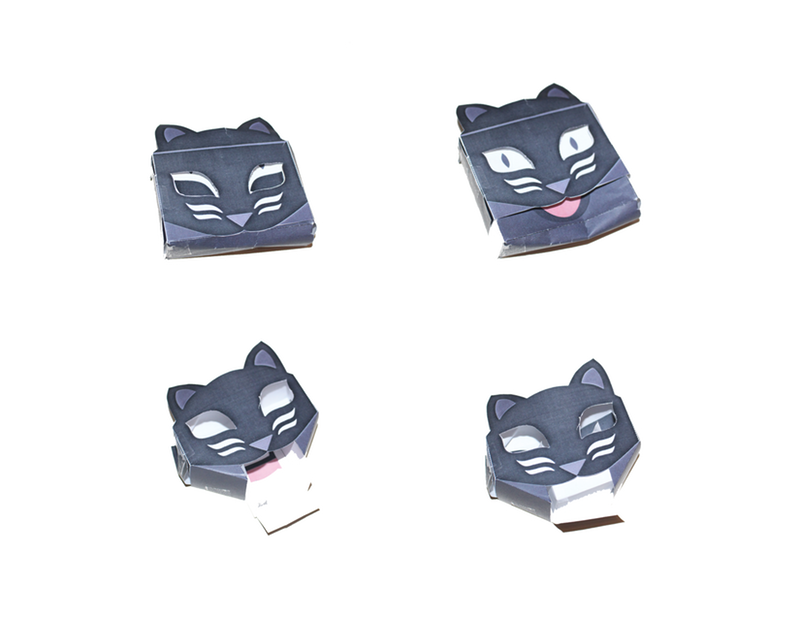
After that, it was all about fine tuning and fixing little details. One of the biggest things to consider was making the package environmentally friendly and limiting its carbon footprint. The material used to assemble the package is biodegradable. No glue is needed to put together this container, as it uses tabs as its main method of connection. The challenge there was figuring out how to put everything together so that it locked and stayed tightly in place. Another challenge was making one part of the container slide smoothly out of the other container. This challenge was resolved with vigorous prototyping. I also wanted the packaging to attract a wide range of customers so I came up with three versions and flavours. The chicken flavour would be a black cat, the salmon a white cat and the beef flavour an orange cat. This way, owners would feel more connected to the packaging based on the colour of cat that they owned.
The final packaging that I came up with is fun and mimics a cat’s excitement upon hearing her owner pick up a box of treats. Cats sleep for 16-20 hours a day so the first face is a sleeping cat. Then upon hearing the treats shaking, the cat slowly opens its eyes and does a double take—”is that treats I hear?” And then finally, it’s fully awake and excited, tongue sticking out and all. The treats are dispensed from under the tongue.
It was also important that the treats match the box so I made my own treats using flower and water and cutting them out using my own cookie cutters that I laser cut, and then put them in the oven to dry and harden. I then painted them with acrylic paint, thinking that the treats would look better and tastier in colour. And also I’ve noticed that no cat treat company seems to make their cat treats in the natural shape of the animal.
Once the product is all gone, the package can be used as a toy for the cat. Cat’s love to play with empty boxes and stick their paws in small openings. As such, I thought this would be a perfect second life for my package.