Redesigning the brand of the Ho Chi Minh City’s developing transit system.
Overview
Ho Chi Minh City (Saigon) is one of Vietnam’s fastest growing city with a current population at 6.5 million people. The dominant mode of transportation is motorbikes. Adults and teens generally prefers motorbikes because they are more affordable than cars and much more convenient than taking the public transit. As transportation is a major contributor to air pollution in Ho Chi Minh City, the government is trying to reduce the use of motorbikes as much as possible.
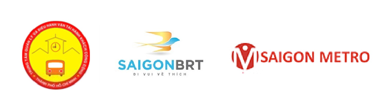
Current branding for Ho Chi Minh City’s public transit
Problem
Although Saigon Public Transit has a difficult duty to change the mindset of the citizens, their branding does not communicate their goals very well. In addition to that, as the city is setting up more transit systems such as a Bus Rapid Transit (BRT) and subway, they did not group this sector together under one identity but has made a completely different identity for the other systems. The Saigon Public Transit needs help in making them more apparent and relevant to the public. Their identity can easily get lost in the overwhelming traffic scene in Ho Chi Minh City as well as not getting enough exposure to the citizens as the public transit of their city.
Objective
Saigon Public Transit one of the very few public transit systems available in Vietnam that needs to work on improving and providing better services to make people want to use the public transit. As not many are willing to take the bus to commute within the city, Saigon Public Transit’s goal is to make taking public transit more comfortable and affordable as well as making the city more environmental friendly. Since they are growing and working on 2 additional systems to regular buses, they need to make statement through their identity as being the official public transit of the city that everyone can recognize and remember.
Process
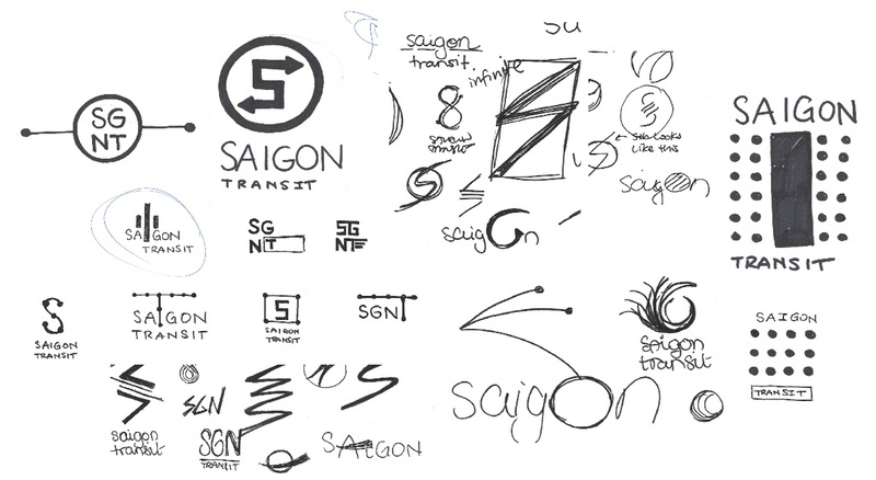
I started with sketches a lots of symbols that are related to traffic as that is a major problem in the city. I wanted the logo to have some positivity for the corporation and so a lot of these sketches try to symbolize the advantages of public transportation touching upon destinations, routes and motion.
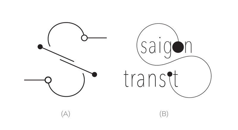
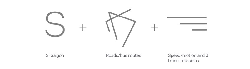
Narrowing down to 2 concepts, I focused on the fundamental of transport which is to take a person from point A to point B. Added to that, people want public transit to be fast and efficient. Concept A uses the S from Saigon with lines crossing through representing the transit’s operation throughout the city. Concept B utilizes type to create a route going from one point to another.
Solution
The concept for the final logo was based on the hectic traffic in the city. The ‘S’ is the initial of the city but it also represents the complicated roads that are not always straight. The diagonal lines in between represent the 3 types of transit systems: bus, express bus and the subway. These lines are also indicator of speed that cuts through the S to imply that taking public transit can be shortcut and a solution to the traffic problems in the city. It is important to emphasize on motion and speed because traffic jams are the norm in Saigon, so in some cases, public transit will be able to avoid that.
The new logo signifies changes and growth of transit in Ho Chi Minh (Saigon). It embraces and emphasize what’s important for transit such as speed and efficiency, additionally making it unique to Saigon. All the elements in this logo has more than one meaning to them making it a constant reminder the purpose of public to the next generation of passengers. The logo addresses the current problems and proposes how the organization is trying to improve to create a better experience.
Stationery

Mock Up
Graphic Burger