Preliminary Research
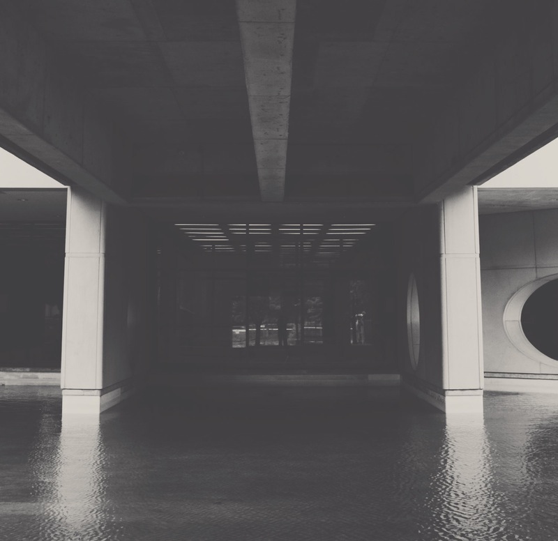
Messence started off as an exploration of the aesthetics and ecology of Toronto’s water infrastructure. The first aspect of this was documenting the aesthetics of water infrastructure around the York University campus. Based on this exploration, I created a booklet documenting these “unseen” functional aesthetics, which would later influence the look and feel of the Messence brand.
Final Research
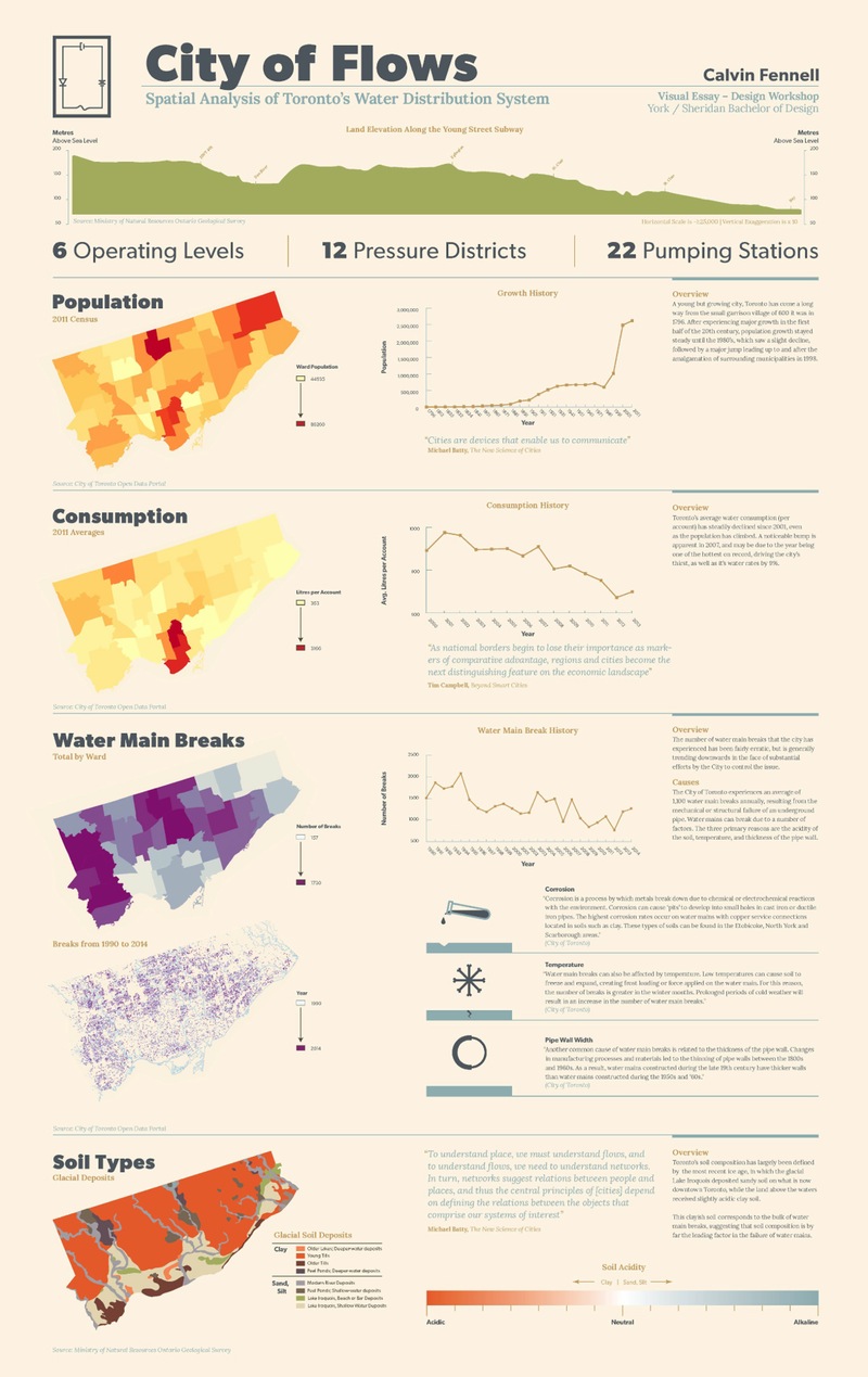
Following the photo documentation aspect, I started to focus on cartographic representations of Toronto’s water infrastructure, and issues affecting it. I discovered a dataset in the city of Toronto’s Open Data Portal showing the distribution of water main breaks throughout the city. Intrigued, I starting researching the topic further, and discovered that the issue had a number of factors that contributed to it. After learning how to visualise these data sets with GIS mapping software, I created an infographical poster arranged around the different layers of the issue.
It was around this time that I came across Michael Batty’s The New Science of Cities, which aims to create a scientific language for understanding the growth of cities and their infrastructures. Batty presents a concept for understanding spatial issues that consists of 4 elements: Actors, Policies, Problems, and Factors. By understanding how these elements of a given social issues interrelate, he suggests we can model the solutions to these problems.
Defining the Project
What is the problem I can address?
Lack of communication and understanding about the complex issues that affect societies
Who are the potential users?
Leaders, politicians, and activists with social, political, and economic power
How can the users meet the problem?
Model, share, and follow issues that are of concern to these agents
Design
Wireframing
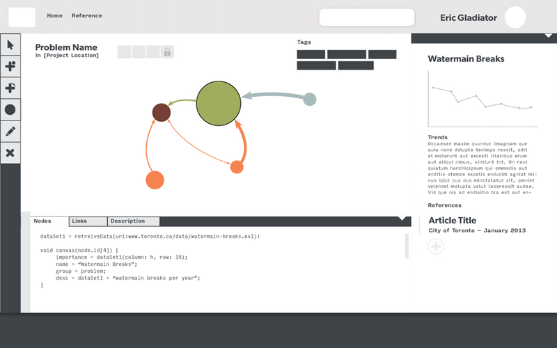
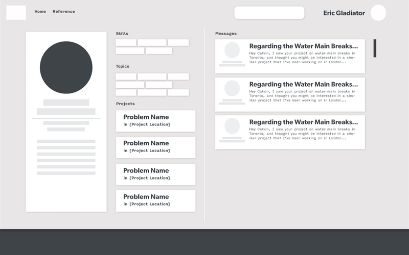
This involved laying out the prefered process that I wanted the user to follow, specifically for the modelling interface and the registration process. I drew inspiration from multilevel flow diagrams, a concept in engineering that I had come across in my earlier research.
Mockup
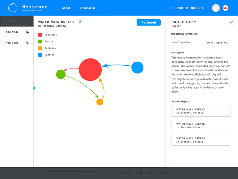
My moodboards generally involved me collecting things off of pinterest and behance that cot my eye in terms of layout, fonts, and colour. Mainly, this was to establish a feel for the aesthetics of the project, keeping in mind the photographic research done at the beginning.
Prototyping
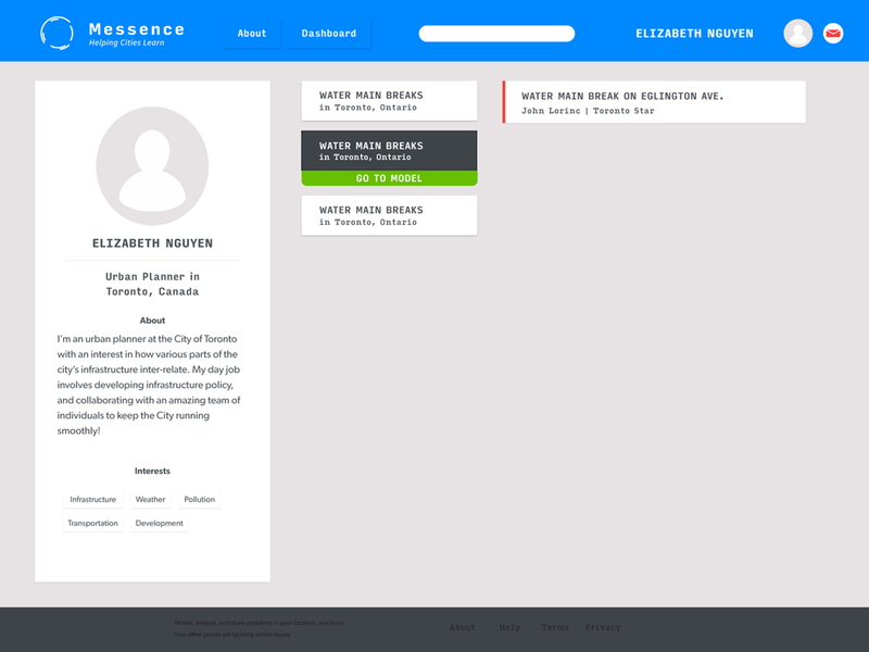
After mocking up the visual style of the app, I started prototyping some of the key interactions that the user would undertake in Framer.js. However, I quickly realized that, given the approaching deadline at this point, it would be far more advantagious to just start developing the site.
Development
The development process was an opportunity for me to really explore javascript more fully, and to practice working with multiple libraries. For the modelling interface, integrating vis.js, which I used for the network models, with the info panels was a major challenge that I was able to overcome. On the dashboard page, getting the news feed to change depending on the selected model was a sizeable achievement. Finally, I learned how to use angular.js with the registration process interest select page, which let me keep my code clean.
