Following my desire to have complete creative control over a brand from the bottom up, I organized a photoshoot, shot campaign images, and created lookbooks that demonstrate my potential brand’s range and variation in style.
Heavensent & Hellbound represents a girl with both good and bad in her. This will appeal to my target audience who feel as if they are slightly rebellious (because this is an alternative style), but still good, confident, fun loving, fashion-forward young (
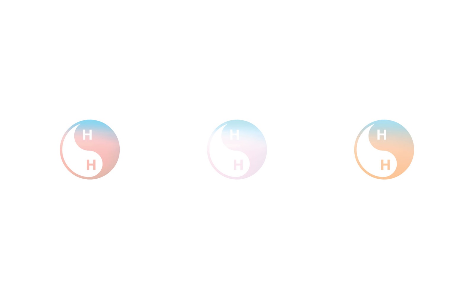
The concept in that way is similar to a yin yang. Instead of the opposing forces (good and bad), this brand thinks of them as complementary. Like a yin yang, one cannot exist without the other, and those who balance somewhere between the two (like the “Heavensent and Hellbound girl”) are often the most interesting people. I enjoy the simplicity of a symbol that has become almost generic, and incorporated into the logo.
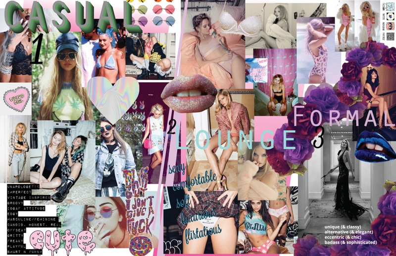
The most critical step in this project was getting the campaign images from which all my work would be based on. I decided that if I had enough time, I would also create posters, magazine and web ads as well as hang-tags for the actual clothing. To get the images, I had to plan a photoshoot. I started by collecting images and exampled. I made a moodboard both for what the brand will and will not be like. It was originally divided up by function: Lounge/Lingerie, Casual and Formal.
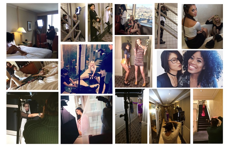
I was able to get a room at the Park Hyatt hotel in Yorkville through a friend, and began planning from there. I wanted to use the hotel/hotel room to create 3 different sets:
1) the bed which was all white (like I was anticipating due to photos of the room) which I would place in front of the window. I planned to do these first to catch as much natural sunlight as possible. This was intended to look like a clean white bedroom where one might be sleeping in on a Sunday.
2) These ones we took in the stairwell. A sports facility or school. For this set we also used the hotel bathroom, but going for more of a grungy motel. This one was the most casual. Originally this was intended to look like a dingy motel, but after I saw the stairwell (which was not pictured on the website) I changed this slightly.
3) An elegant event, hotel or building with rich colours, dark wood, etc. feeling of luxury. These are the ones we took in the hotel hallways, and include most of the formal wear.
I decided on a date, and starting looking for help. I found a Facebook group and made a post with the moodboard and asked for volunteers and I got a surprisingly overwhelming response. I selected 6 models of the 70+ that were interested.
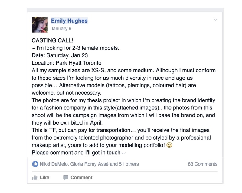
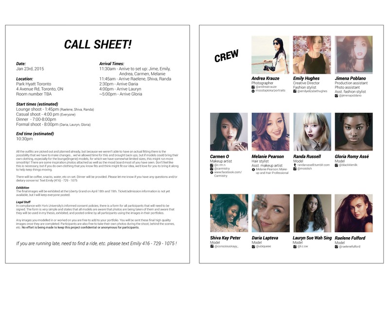
After I selected the models and the photographer I roughly planned out each outfit and which model would be wearing what. I allotted 20 minutes per shot and planned the day out that way.I created a document before hand and sent it to the MUAs that had makeup inspiration for each look. I did this so they would know what to bring (i.e. excessive glitter) and what style they would be working in the day of the shoot. I also printed this document out and physically brought it to the shoot. This actually significantly sped up the discourse between the MUAs and stylists, and the MUAs were able to nail each look without being confused by our attempted explanation.
Similarly, I collected a folder of images called “model poses” and put it on my ipad. A couple instances when the models weren’t understanding what we were looking for or ran out of new ideas/poses, we all took a time out and went through the images. We never got through the album before someone was struck with inspiration and the shoot continued in a fresh new direction.
I made and distributed a call sheet beforehand detailing everything about the day, what time to show up, and who else would be there.
The photoshoot went really smoothly, we stayed on schedule and everyone involved had a lot of fun. Although it was an 18 hour day for me the time flew by because I was experiencing creative flow. I would definitely do something like this again. I am really glad I went through with these plans because it gave me a renewed sense of creative confidence. I learned that this is something I should probably consider doing as a career.
After seeing the contact sheets and making the selects, I realized that it made more sense to reorganize the collections based not on function, but style.
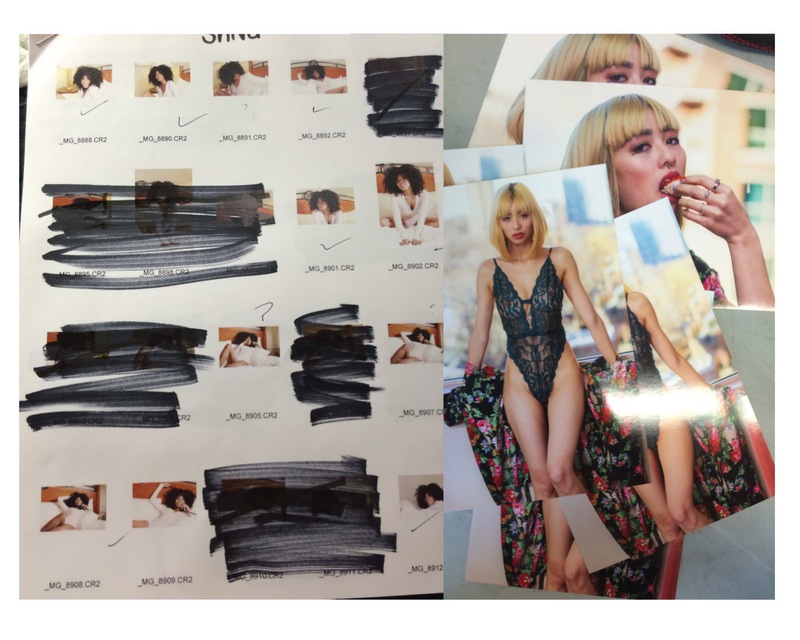
The Lounge/Lingerie collection remained the same, and I separated the remaining photos into two very distinct categories. I then remade more accurate mood boards based on the contact sheets and reorganized images. I believe I will be able to clearly show the brand’s versatility in these three collections; each of which differs aesthetically enough to be clearly separate collections, but consistent enough to be of the same brand.
There are three collections; Come As You Are, Dreams and Wake Me Up When I’m Famous.
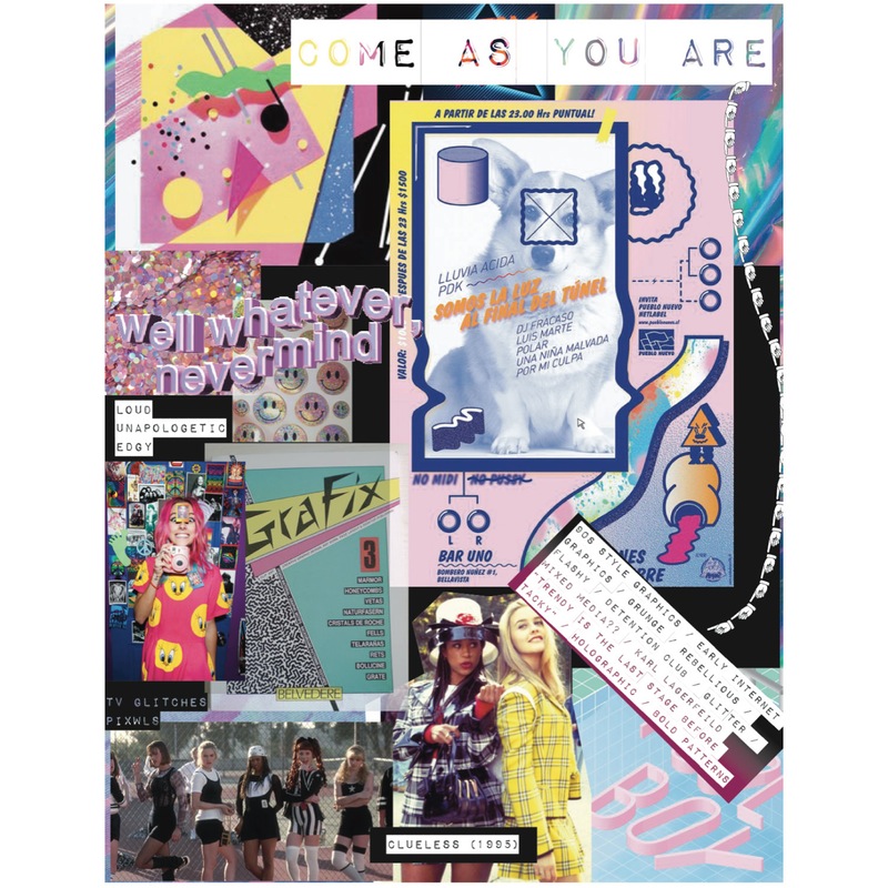
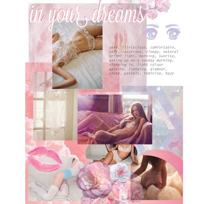
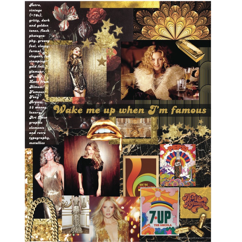
The lookbooks that will be displayed at gradshow include the final images from the photoshoot. They will demonstrate the versatility of my brand as well as show what I can do when working on something I’m passionate about. I’m extremely excited to unveil them at The Intermission.
