What does mental illness look like? How can it be visually represented to communicate its effects, in a medium that’s relatable to the Millennial generation?
Context: Why?
The idea for this project came from my personal experience learning about mental health. A few of my close friends are dealing with depression and anxiety, and I found that it was extremely difficult to understand their symptoms because it’s a completely foreign mental state. My friends have also told me about troubles with their family for the same
Lack of information isn’t the only issue. With the advent of social media and the overwhelming amount of information we have at our fingertips, a whole new set of problems arise. A lot of the information that we get from the Internet is often inaccurate. Specifically, microblogging sites tend to misconstrue mental illness and perpetuate misinformation. According to research, Twitter is prone to trivialization. Tumblr users are more likely to romanticize mental illness such as depression and promote ideas of “beautiful suffering.”
To remedy these issues, I designed a campaign that circumvents the current connotation of mental illness to focus on the human aspects; creating empathy by simulating their (very real) symptoms. The campaign aims to redirect the discourse of mental health to a more relatable
(A lot of) Research
Twelve weeks of thorough research was the foundation of this project. Research ranged from basic mental illness diagnostic symptoms, to types of stigma, to mental illnesses affecting Millennials and reasons why, to the effect of the “online community” on mental illness. I also analyzed existing campaigns and their strengths and weaknesses. From the research I was able to learn about the current state of online mental health discourse, what it was lacking, and that I needed to create a way to circulate more accurate information in mediums that are easily accessible to Millennials.
In order to learn about mental illness more intimately, I interviewed friends who deal with mental illness about their experiences. Their informal, personal, and emotional responses serve as the content for the campaign, and communicate the intended message in a new, effective way.
The Design Process
I began by gathered images of existing brands related to mental health awareness. A lot of them seemed to use cliché visual treatments to target Millennials, such as sketchy, handwritten type and vector art infographics. Others settled on monochromatic photographs of people looking sad. I found no campaigns that communicated the message in an abstract, emotive way.
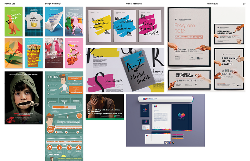
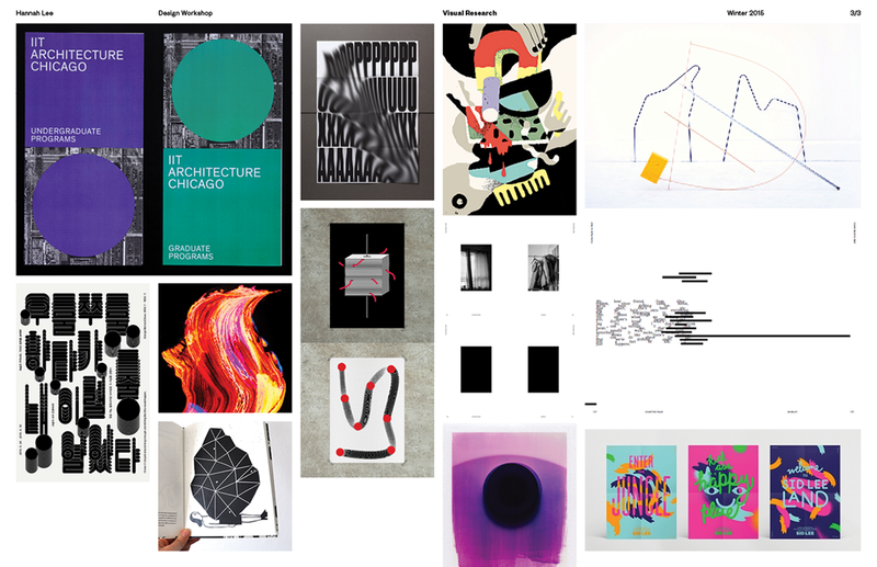
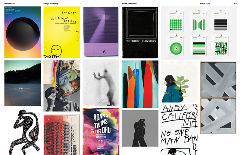
The campaign highlights the top three illnesses that Millennials are affected by: clinical depression, social and generalized anxiety disorder, and panic disorder. I created a word bank for each illness, and collected images that contain what I aimed to incorporate: deep, rich colours, poignant textures, and expressive typography. The images acted as reference for my intended visual language.
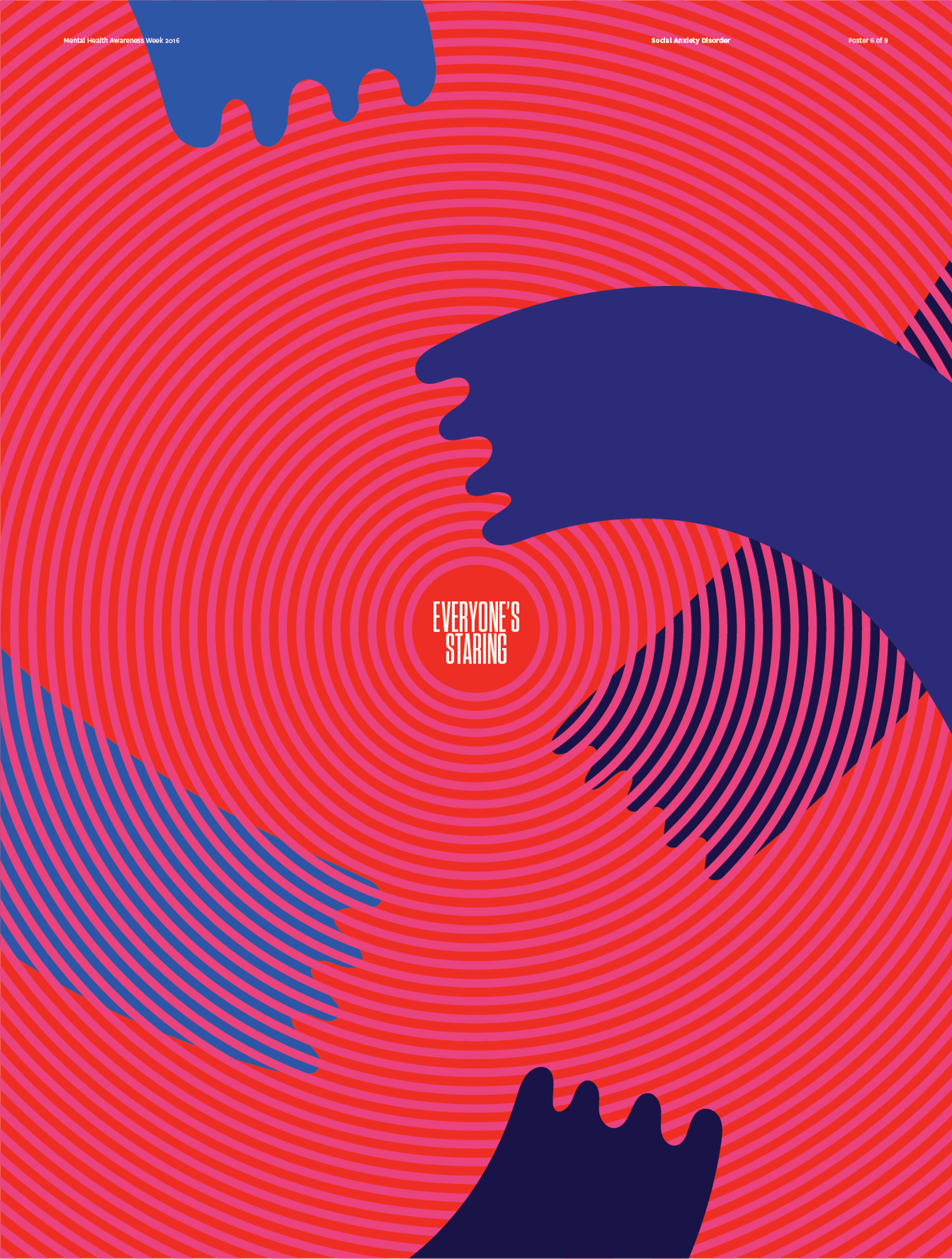
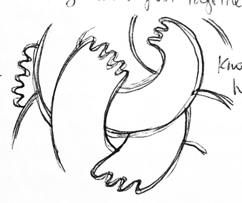
The main visual elements of the campaign are a knot, and hands. I felt that the knot was a good representation of the frustration and anxiety that comes with mental illness, and hands are distinctly human (and sometimes a bit eerie).
The Outcomes
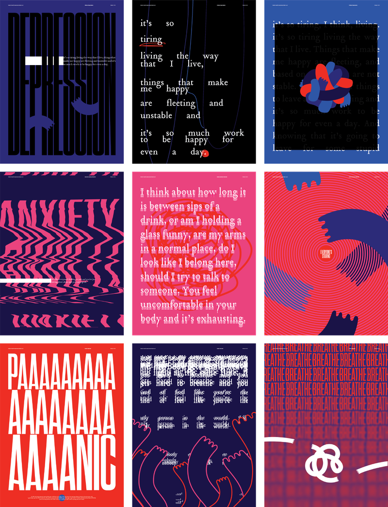
With this set direction, I began by designing three sets of three 18” x 24” posters from which to derive all other visual elements of the brand. The sets visualize the three illnesses in different ways. The result is an immersive experience that is both provocative and informative.
The second visual implementation of the brand comes in the form of three short videos, which would be inserted as advertisements before YouTube videos. Each video is a short narrative that typifies an experience from a person who suffers from mental illness. The end of the videos leads the viewer to the campaign’s designated website.
Here are links to the clinical depression and panic disorder videos.
The website houses stories told by anonymous friends, outlining how it feels to live with mental illness. Rather than sharing facts or statistics, the campaign acts as an archive and aims to replicate emotion and encourage
So?
Through On Your Mind, I hope not only to raise awareness, but create a dialogue that approaches mental illness in a more direct, human, compassionate way in a social sphere prone to stigma, trivialization, and romanticization.


