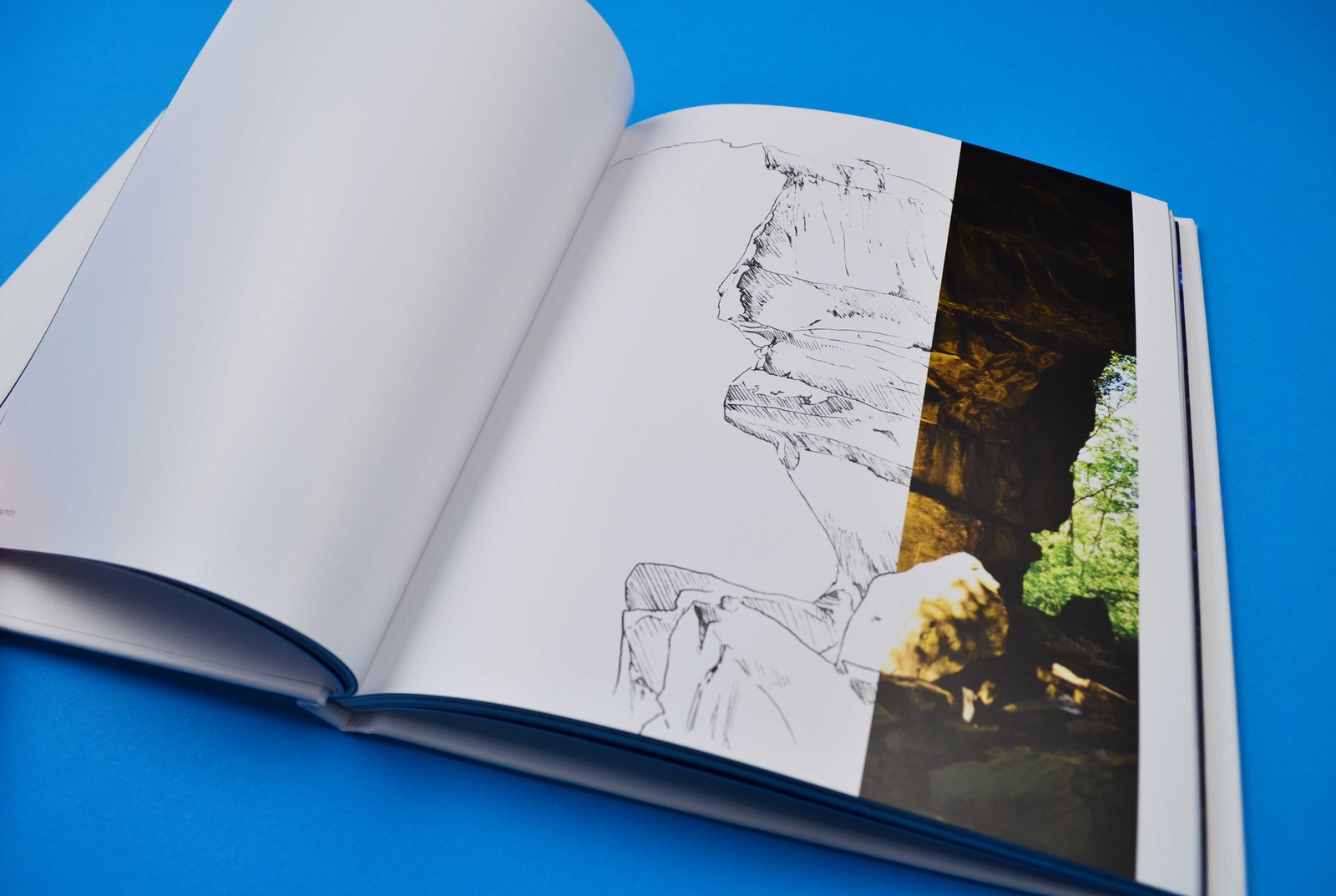
The purpose of this project was to create a personal travel journal that showcased the beauty of Ontario.
Concept
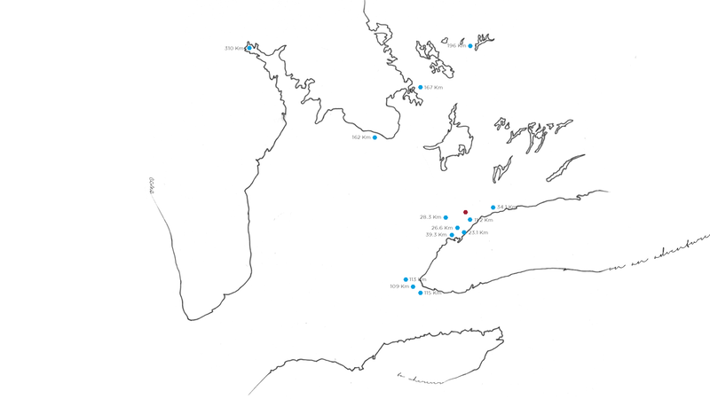
The idea was to give the reader a sense of what the location offered and a small glimpse into its beauty. The whole concept revolves around the idea of spontaneity and an incomplete picture. This is the reasoning behind the lack of pagination and a modified table of contents. Instead of a standard table of contents, it is simply a map of Ontario with markers on the locations visited. Each marker has a number beside it, which indicate the distance from my home. The names of the locations were only included in the spreads that highlighted these places.
Aesthetic
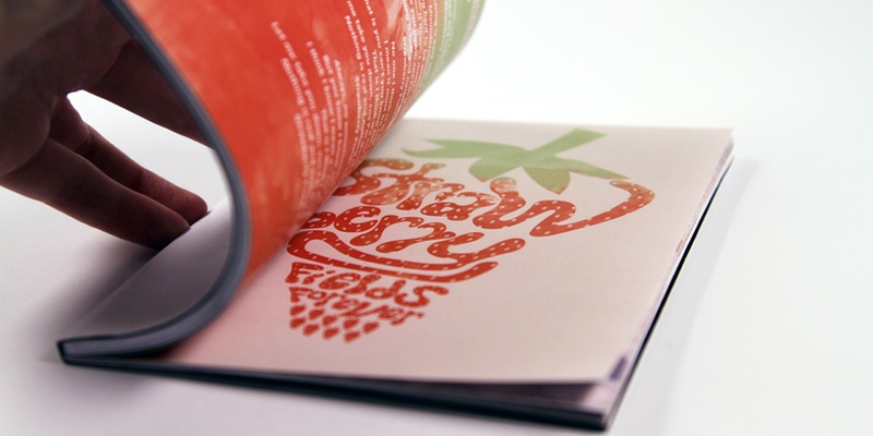
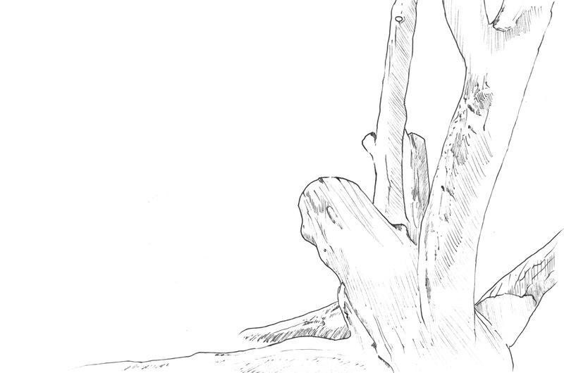
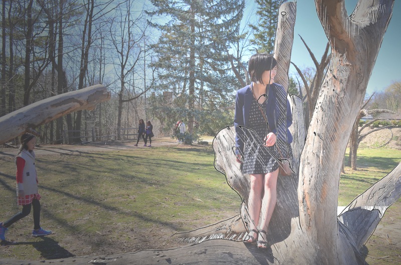
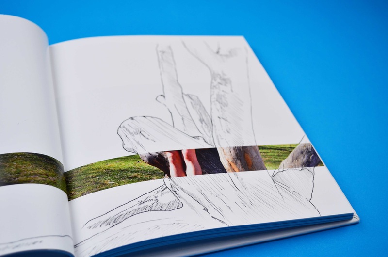
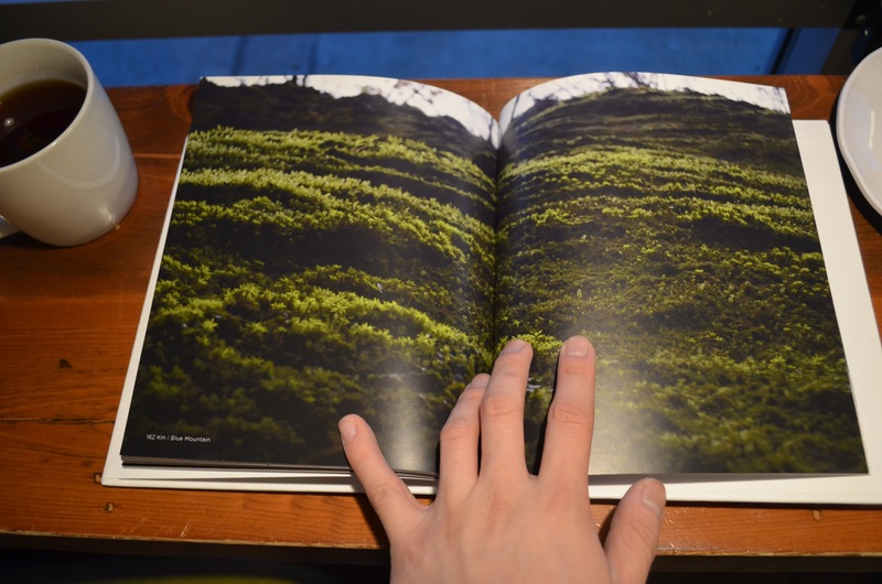
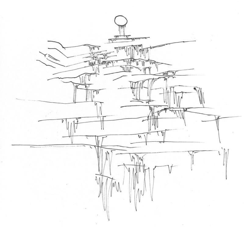
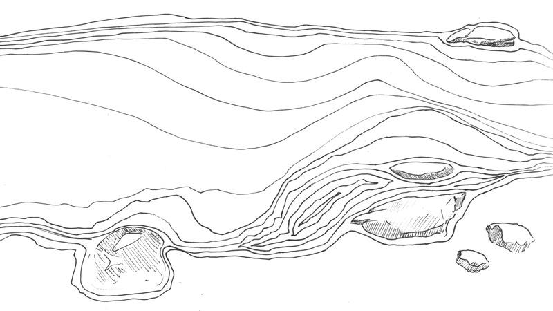
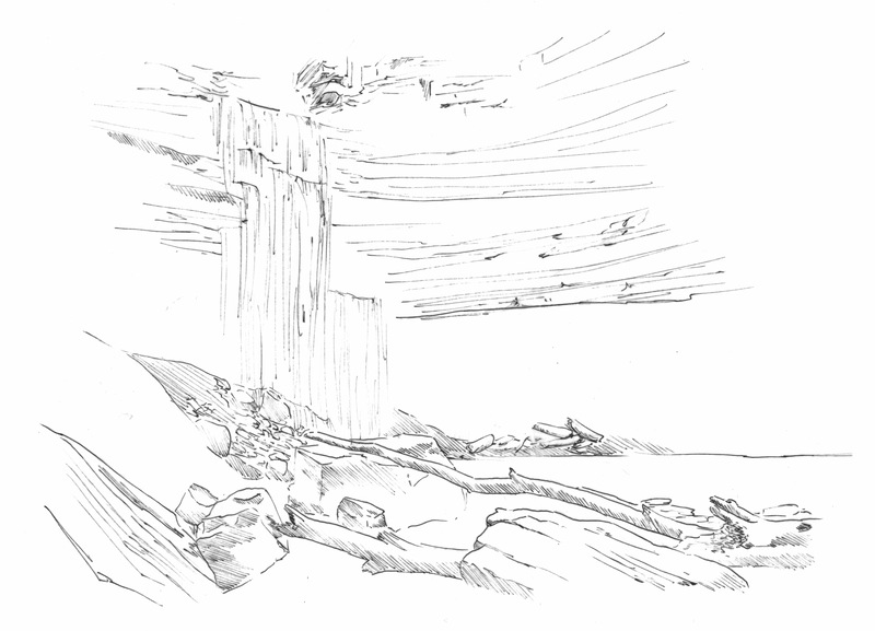
To prevent the book from being purely images, I decided to include illustrations to pair with the images. Originally, the use of acetate paper or transparent paper would be used to hold the illustration. This would be so the illustrations would match up over the original image to project my own thoughts without drawing on the image itself. What I chose to do instead was to merge the illustration with the image. Only key parts of the image were illustrated in order to keep it simple.
An Incomplete Picture
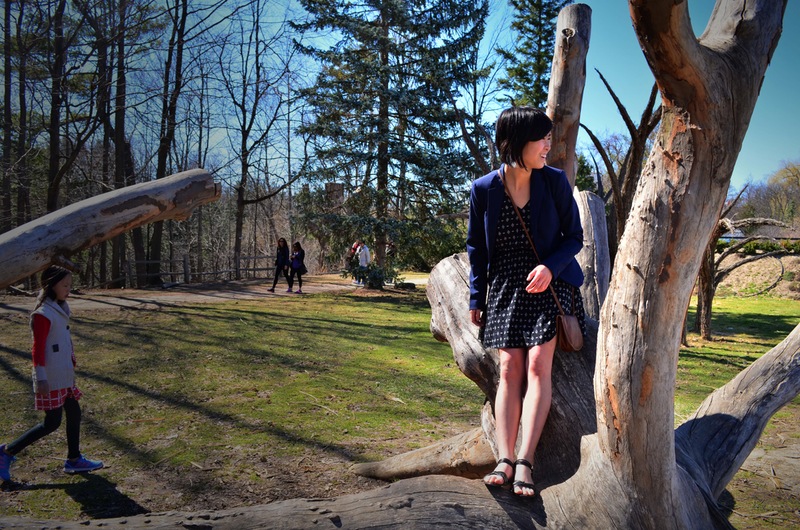
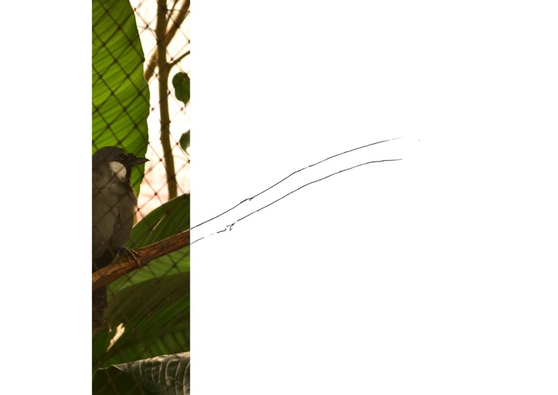
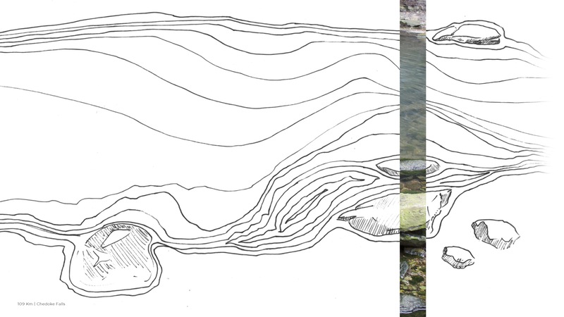
The idea behind the incomplete image was to let the reader fill in gaps with their own imagination. This was done with the hopes that people would become interested enough to go and experience these places for themselves. Only the opening spread for the location and a few other spreads scattered within the book were merged with illustration. Other images remained cropped unless they held a significant value to be kept as a full bleed image. Some illustrated spreads were highly detailed and others had a simple line to emphasize certain parts of the image.

Exploration
This project was highly experimental in the way it explored framing images and pairing them with illustration. I wanted to explore cropping images to the point where it excluded key aspects and I wanted to explore illustration in both high detail and in showing motion or energy. Many of the images taken were of waterfalls, and I had no idea how to illustrate the falling water and all the energy that was captured in the images. I could only settle for a representation of all the energy.
Endless Adventure
Overall, this is one of favourite projects to date. It allowed me to use all the photos I take on adventures in a way that was special to me. It combined my love for hiking and exploring as well as my love for editorial design and illustration. Hopefully, this is the start of a yearly personal project of my adventures.
