Community Identity
A traditional brand tries to identify one major characteristic of its subject. However, this community has lost sight of what it represents and what defines it.
The area lost many of its heritage buildings to a failed condo development project. The new graphic identity would create opportunity for Port Dalhousie to develop new myths that define the area. With a lack of connection to the past, new stories for the future need to be created.
The Challenge
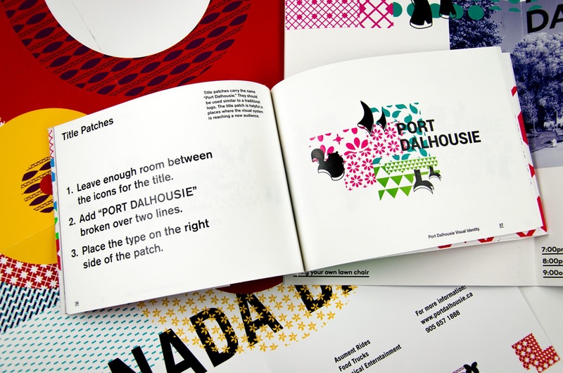
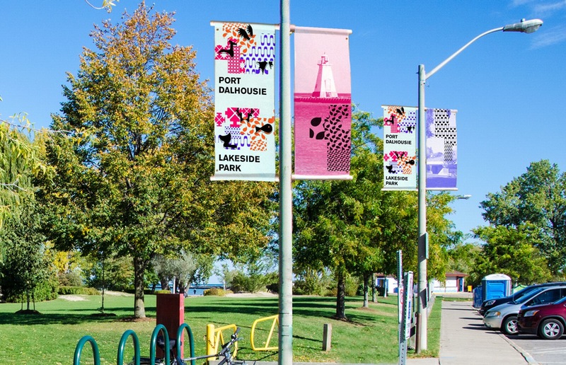
This identity needed to be flexible and open to interpretation. To allow the local community to access and use the identity to create their own communications, the system needed to be set up as a toolset rather than a single graphic. The identity would reflect the emerging narratives of Port Dalhosuie: arts and culture, and reconnection to nature.

The Result
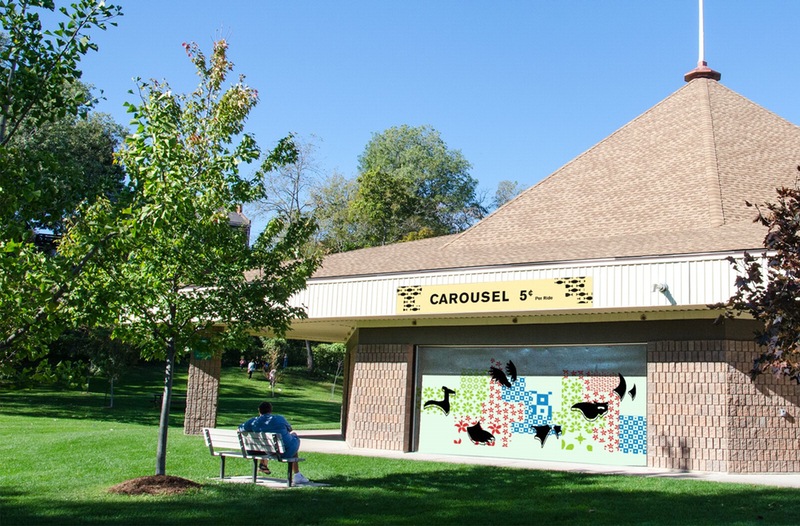
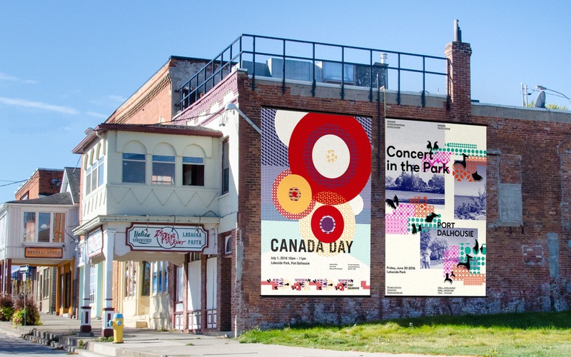
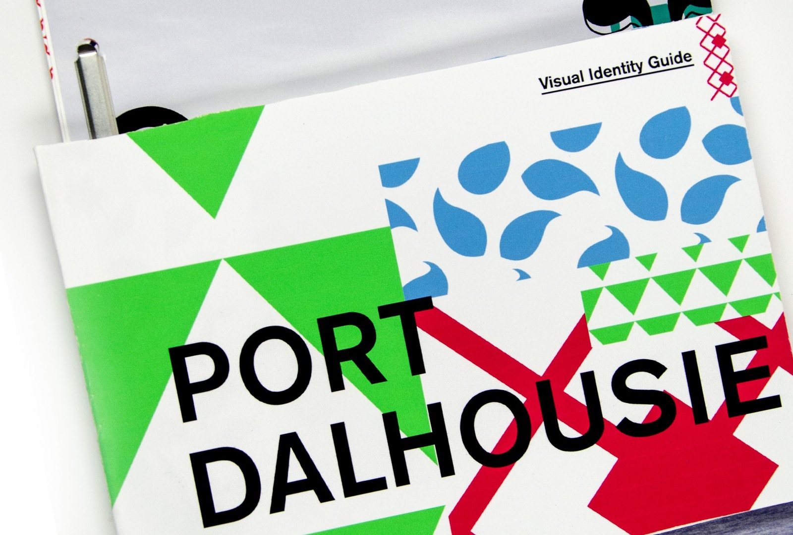
The resulting graphics are inspired by folk art and mythical animals. By blending the animal icons and patterns together new myths are created. The visual elements are provided as the base and the brand book defines the guidelines that create the artwork. By using guidelines rather than strict rules, the identity becomes more accessible and highly flexible. For example, there are no pre-determined colours or fonts, making the identity accessible to those with limited resources.
