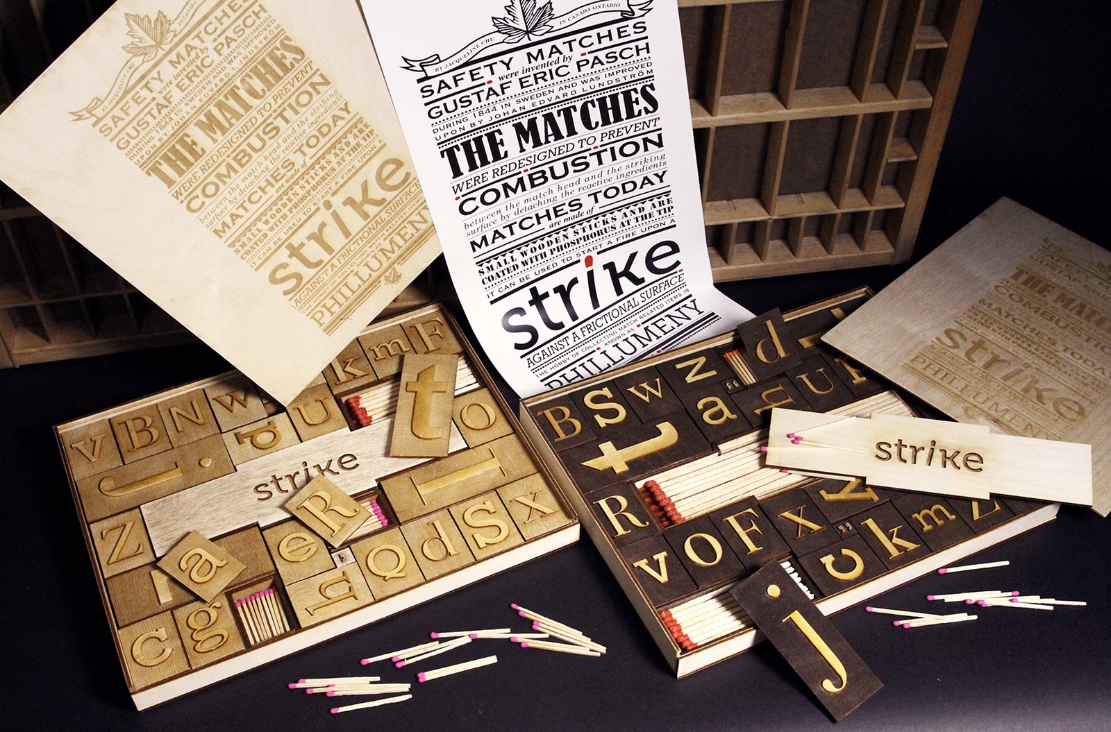
A match is a small object with endless possibilities as to how it can be packaged tends to be overlooked and lacking in creativity and variety. Therefore I decided to design the packaging to not only be aesthetically appealing, but innovative, engaging, educational, and as a collectable item.
Humans as consumers are usually inclined to reach for packaging that are attractive and playful, but the existing packaging for matches are lacking in both the aesthetics and in innovation. Presented with these issues, I decided to Redesign the packaging to become a sustainable, educational, and is visually intriguing. It is a lost opportunity that the existing packaging does not address any of these problems. Solving these pronounced issues could increase attention from the intended audiences and teaches them to become more knowledgeable about matches.
Going into this project, it is crucial to do the research in order to have a better understanding of what matches are: how they are made and used, where and who uses them, and why they are used. With these information gathered I would have a better grasp of whom my target audiences are and what elements are missing with the current packaging of matches.
So how are matches and movable type related? After pages after pages of research, sketches and prototypes, I decided to design a
Coming up with a memorable branding was also a process that requires well overall understanding of matches and type. The branding needed to be short and simple for the audience to remember, but also related to matches. Originally, the initial brand name I developed was “Stroke” to represent the strokes used to create letterforms and the motion created when lighting a match. However due to the negative connotation behind the word “stroke”, I later decided to go with “Strike”. Strike also represents the motion of striking a match as well as the striking resemblance the packaging have to wooden movable type. With the branding established, it can be applied to throughout the packaging.
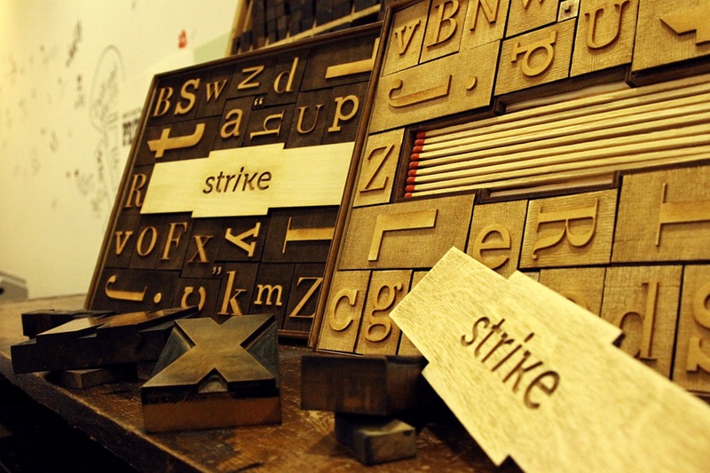
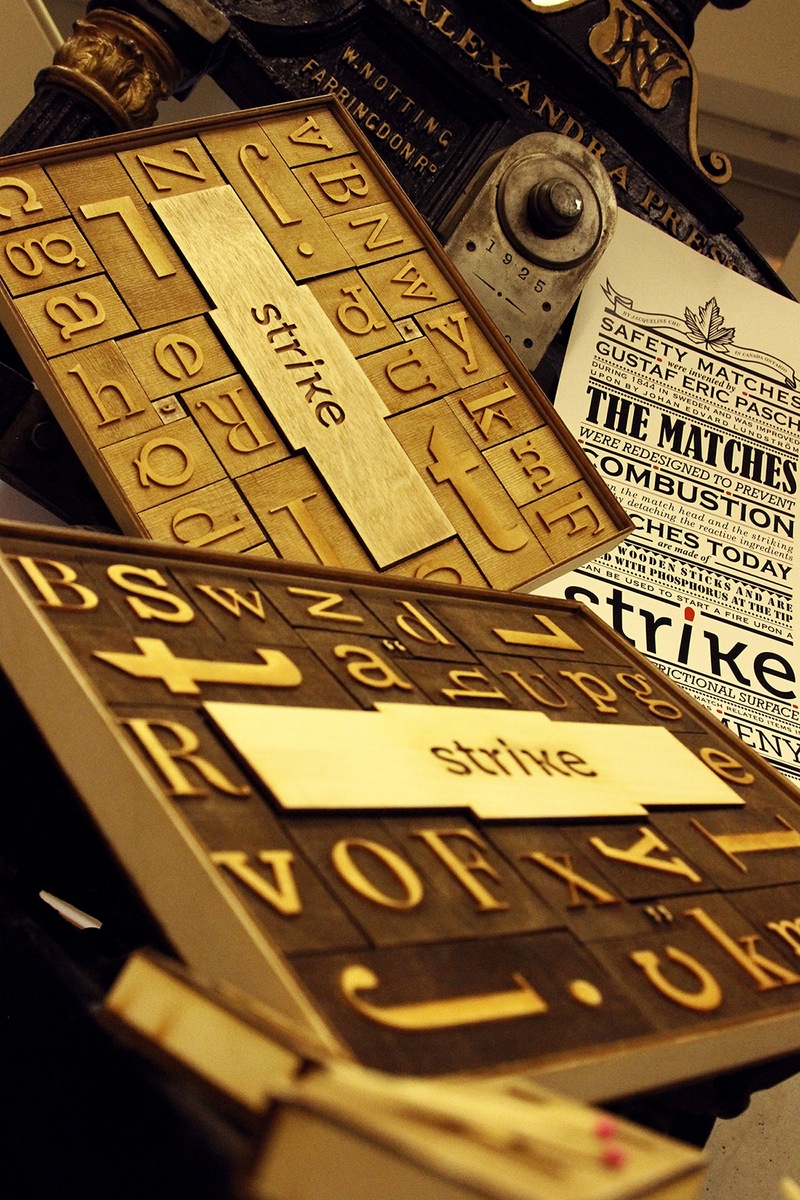
Due to the matches and movable type being packaged together, I was able to redesign the current match packaging that is lacking in creativity to something more creative. “Strike” is an innovation and educational set of matches designed to be the centerpiece for any collectors, designers, and type enthusiast’s coffee table. The set of 27 unique look-alike wood type matchboxes were shaped to portray the wooden movable types that were used centuries ago before printing machines were invented. Each matchbox represent a letter in the alphabet and with one carrying the brand name. There are three different sizes of boxes which each contains different length of matches. Similarly, wooden movable type also comes in varieties of sizes. The small and medium sized matchboxes are designed to be portable and fit within a person’s shirt or pant pockets. The larger matchbox is made to stay and be used within the household.
“Strike”, the match packaging was created to educate the target audience on the history of matches as well as the history of type with the use of a typographic poster engraved on the top of the container’s lid. Not only was it an appealing and an educational set, the packaging is also playful, allowing the individual matchboxes to be rearranged in a manner where words or sentences can be formed. Once the matchboxes are emptied, the matchboxes can be REused to hold candies and other sweets to welcome and impress guests when they are over for a visit.
During the process of developing and creating the packaging, I learnt that the preliminary steps of developing the concept for the packaging are critical. Prototypes plays a large role in further evolving the packaging because packaging is such a physical element, it requires one to physical look and hold it in order to fully apprehend what needs to be changed or what is working. The more prototypes made, the more refined the final product transpires to be.
