You’re invited to

The Intermission: Grad Show

When

Tuesday, April 19, 2016

Industry Reception

4:30pm—7pm

Doors Open

7pm—11pm

Where

The Liberty Grand

25 British Columbia Rd, Toronto

The Intermission is the 2016 York/Sheridan Program in Design’s annual showcase of the best work produced by its graduating class. It is a night for the industry to connect with emerging designers and explore their works, and for students to celebrate their past four years of hard work with you!

Getting to the Show

Getting to the Show

TTC
29 Dufferin → Saskatchewan Rd
504 King → Dufferin St
509 Harbourfront → Manitoba Dr
GO
Lakeshore West → Exhibition
Get directions on Google Maps

Frequently Asked Questions

Is the show free?

Yes, absolutely. However, we do help fund the event through sponsorships. If you’re interested in supporting this or future years, get in touch.

What can I expect to see and do at the show?

The show is an opportunity to browse the work and meet in-person with grads from one of Canada’s top design programs.

Will there be drinks?

Yes, we’ll have a cash bar available throughout the night.

What is the 'Industry Reception' portion of the show?

We dedicate a part of the night exclusively to people working in the design and creative industries. All students will be there to answer any questions about their work and experience. No ticket or registration is required.

I'll be at FITC on April 19th. Can I still come?

Definitely! The FITC schedule ends at 6pm on April 19th. We’re open until 11pm, so there’s lots of time if you’d like to swing by in the evening.

Where can I park my car?

There is a parking area located beside the Liberty Grand that will be available.

Come Meet the Cast!

Let us know if you're coming on Facebook and add the event to your calendar. We hope to see you there!

Grad Show Liberty Grand, TorontoApril 19
View Event Details
View Full Site
View Event Details
Menu
View Full Site
Type Design
Nimble

About

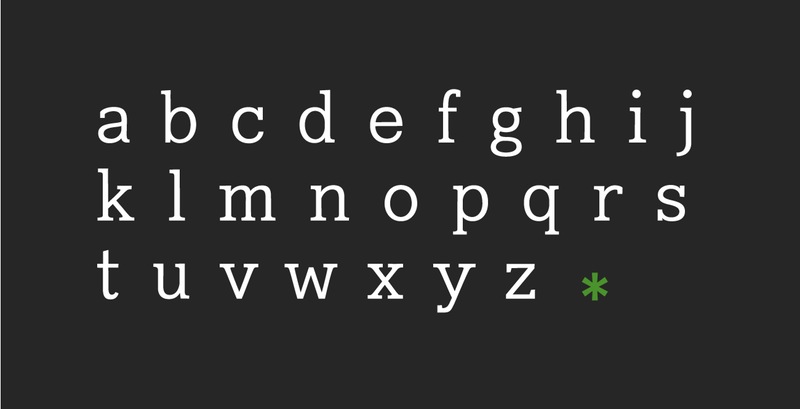
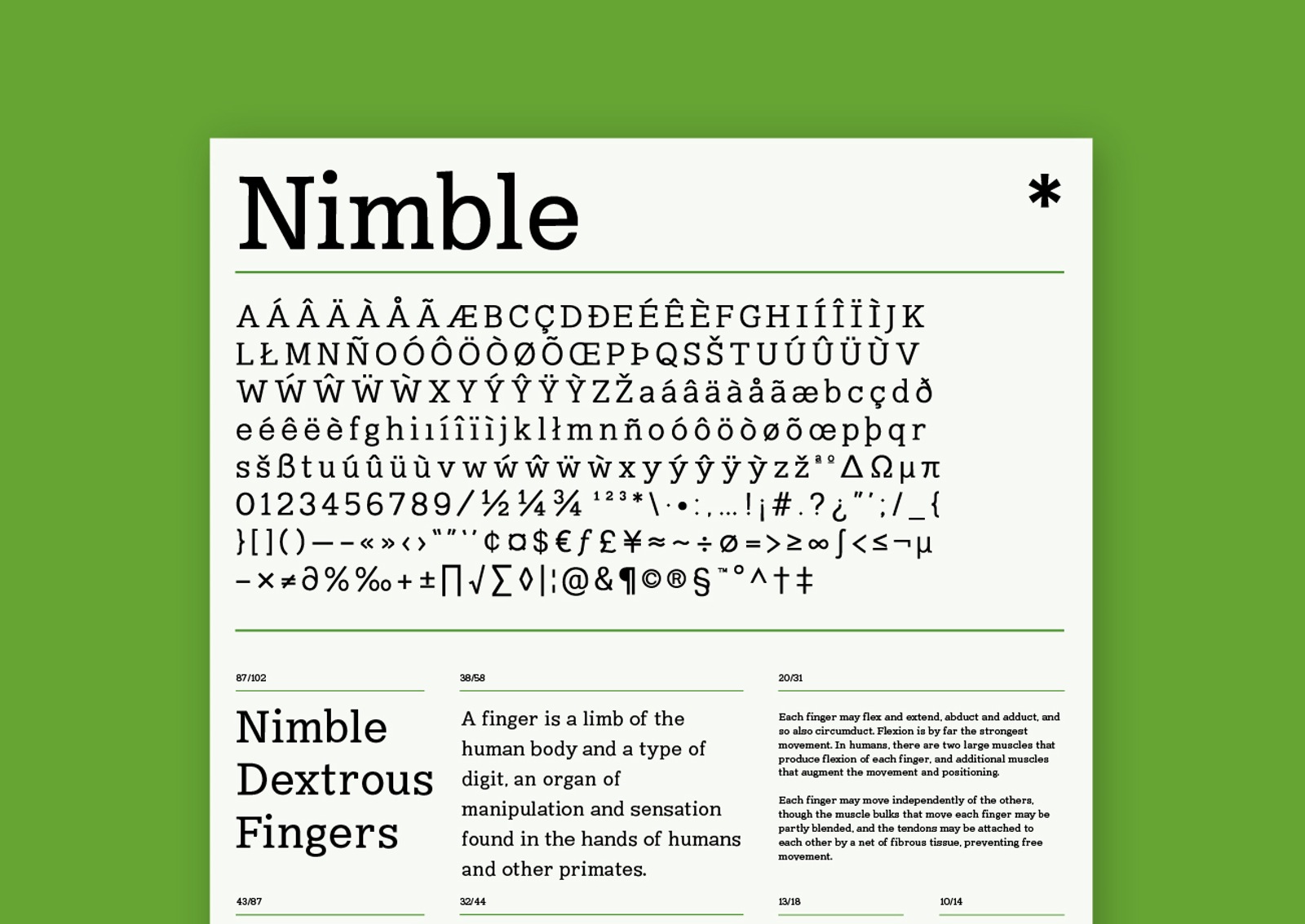
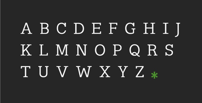
Nimble is a slab serif typeface inspired by Clarendon, New Century Schoolbook, Eames Century Modern, and Archer. It is a typeface made to operate well as body copy, especially at smaller point sizes.
The Concept

The idea behind Nimble was to create a typeface that was unintimidating, but still appear to be intelligent. The decision was made to make a slab since I felt a lot of the slab serifs I was used to seeing felt sluggish and a little too quirky to be used as body font.

The project was a real learning experience for me, being the first typeface that I put a lot of time and effort into making. I had a hard time deciding on what kind of typeface I was going to produce at the beginning, and for a brief time the project shifted from to form. I decided to create a slab serif since I was unsatisfied with the choices of slab-serifs that I could use.

The Grind

The process behind Nimble was an incredibly iterative one. Since this was one of my first typefaces, I decided to go with something that was more traditional. Initially I had started out with typeface that was a mixture between a slab serif and a ball serif. The typeface changed because I found that the ball serif parts of the typeface just weren’t working with the rest of the serif’s I had. Since I had a mixture of adnate and abrupt serifs, trying to add both slab and ball serifs to the mix wasn’t communicating what I intended.
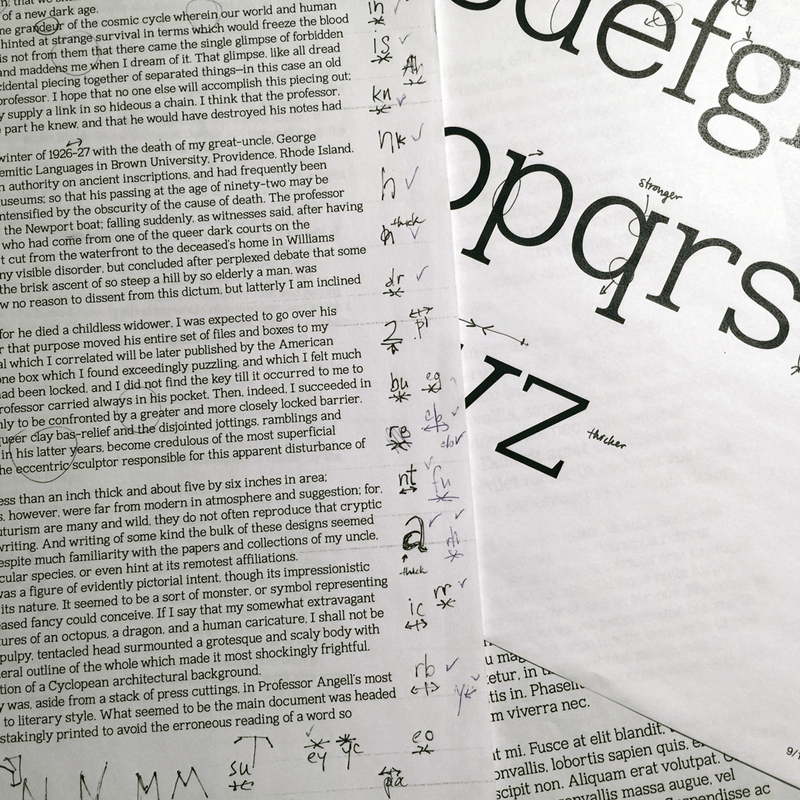
I experimented a lot with kerning and sidebearings a lot during the process and I went through several systems of sidebearing and kerning. It was difficult determining what the ratio between the sidebearing and kerning should have been, and how much each of the adjustments would influence the overall look and feel of the typeface.

Test Nimble here