After doing a benchmark analysis of generic movie titles in the romantic comedy genre, I made a typeface that better reflected and communicated the spirit of that category. I researched romantic comedy movies as a genre and how they were perceived by viewers. The plots were similar and perhaps as a result, so was their visual representation, as can be seen below:

I looked at their posters and DVD covers and I saw little variety, particularly in typographic treatments. There was widespread overuse of generic, light sans serif typefaces, especially Helvetica. These are not bad typefaces. The problem is that there is little inherent personality to the letterforms themselves. They don’t convey the energetic, often over the top nature of the characters and plots of romantic comedies.
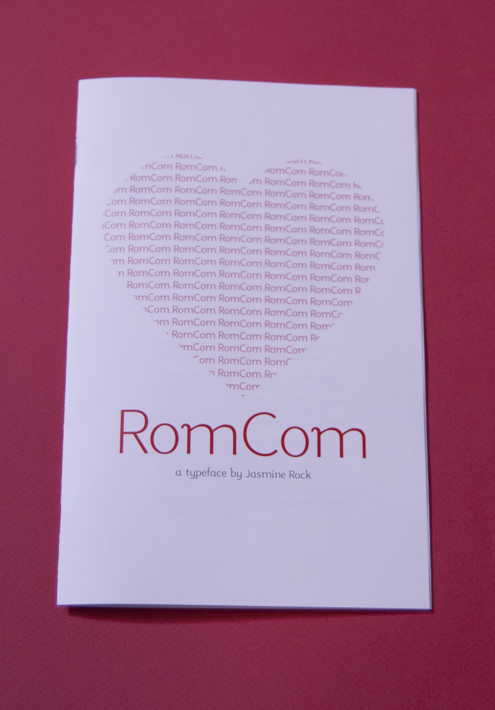
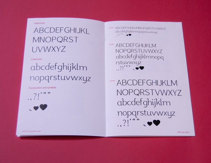
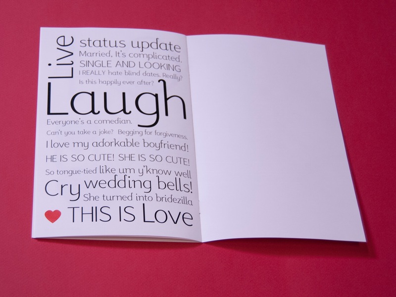
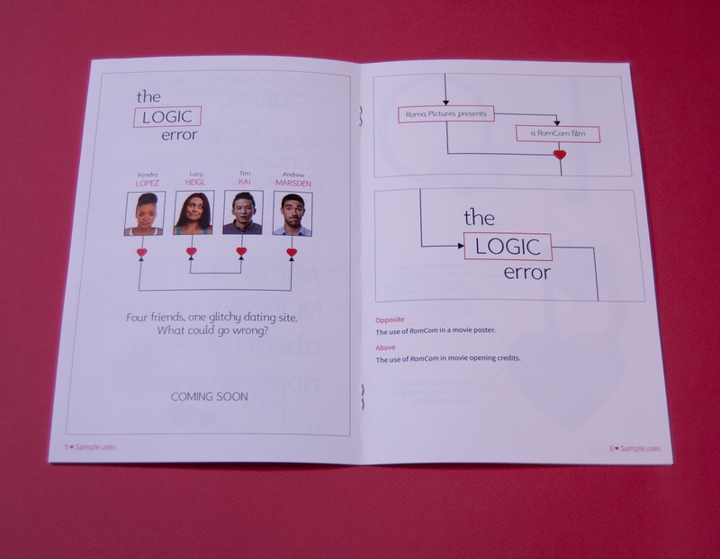
In response to this problem, I made a typeface that had a playful personality, but wasn’t sappy. I named it according to its purpose: RomCom. It is meant to better communicate the message of the typical romantic comedy, or subtly differentiate a more original film from the rest.
I looked at some examples in the Little Book of Lettering for ways I could handle the terminals. From research, I moved on to sketching the letters that form the backbone of every typeface: Hamburgerfontsiv. These letters give you the cap height,
I knew the characteristics I wanted RomCom to have, but I didn’t know exactly what features and shapes would best express that. At first, I tried rounding off corners and playing with curves and ending the terminals in a playful, curvy way. The idea of having the letters connect like a script came up during critiques, but I decided not to go in that direction.
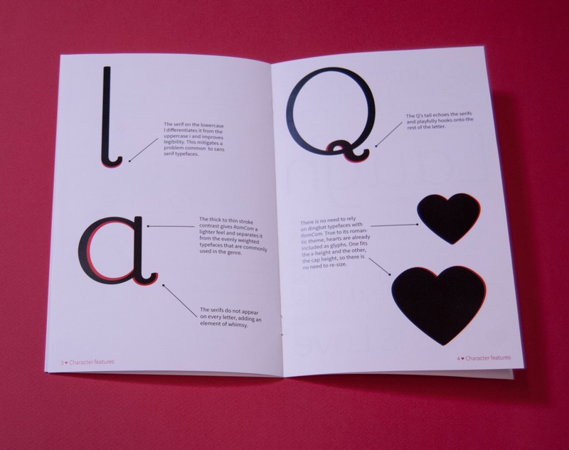
Although the process was long, and at times, difficult — I persevered and made something I am proud of. I enjoyed making RomCom and I have since continued work on it. I am adding more heart ornaments and I have started an animated type specimen.
