Complete
DEF CON is heavily oriented towards computer security enthusiasts and experts. The focus of the conference is organized around talks given by various experts in the field regarding new developments and vulnerabilities in the field of computer security.
The conference generally attracts thousands of attendees from diverse communities, and tickets are distributed at the door on a first come first serve basis. Originally the conference was oriented towards members of the “cracker” and “demoscene” subcultures (experts at decryption, the removal of DRM, and general tinkering). The cracker scene is composed of separate release groups and as the convention matured it appealed less to more “juvenile” cracker activities, and oriented itself more towards the hacking and security scene. Although the conference has changed over the years and now deals with the absolute bleeding edge of computer security the branding and promotional material for the conference seems to have stayed the same since the 90’s.
My challenge was to create branding and promotional material for the conference that reflected the themes, traditions and legends of the hacker scene. I also challenged myself to avoid the tropes of the genera, things like gas-masks, neon green, dreadlocks, and anything that looked like the cascading text from the matrix.
I originally started with three distinct themes. The first was narrative based in my head I pictured it like the cover of blade runner or Indiana Jones. What it turned into was a weird laid back, blue, and black composition, that I had geared to represent anonymity and identity in the digital world (a theme that I also tried to incorporate in my other designs).
The second design was oriented towards an imaginary occult language something that I would have incorporated into all the promotional material from the show. The language would form a puzzle for the attendees of the conference to decrypt. Puzzles and challenges like this are common at defcon, and I thought it would be an interesting opportunity to create my own.
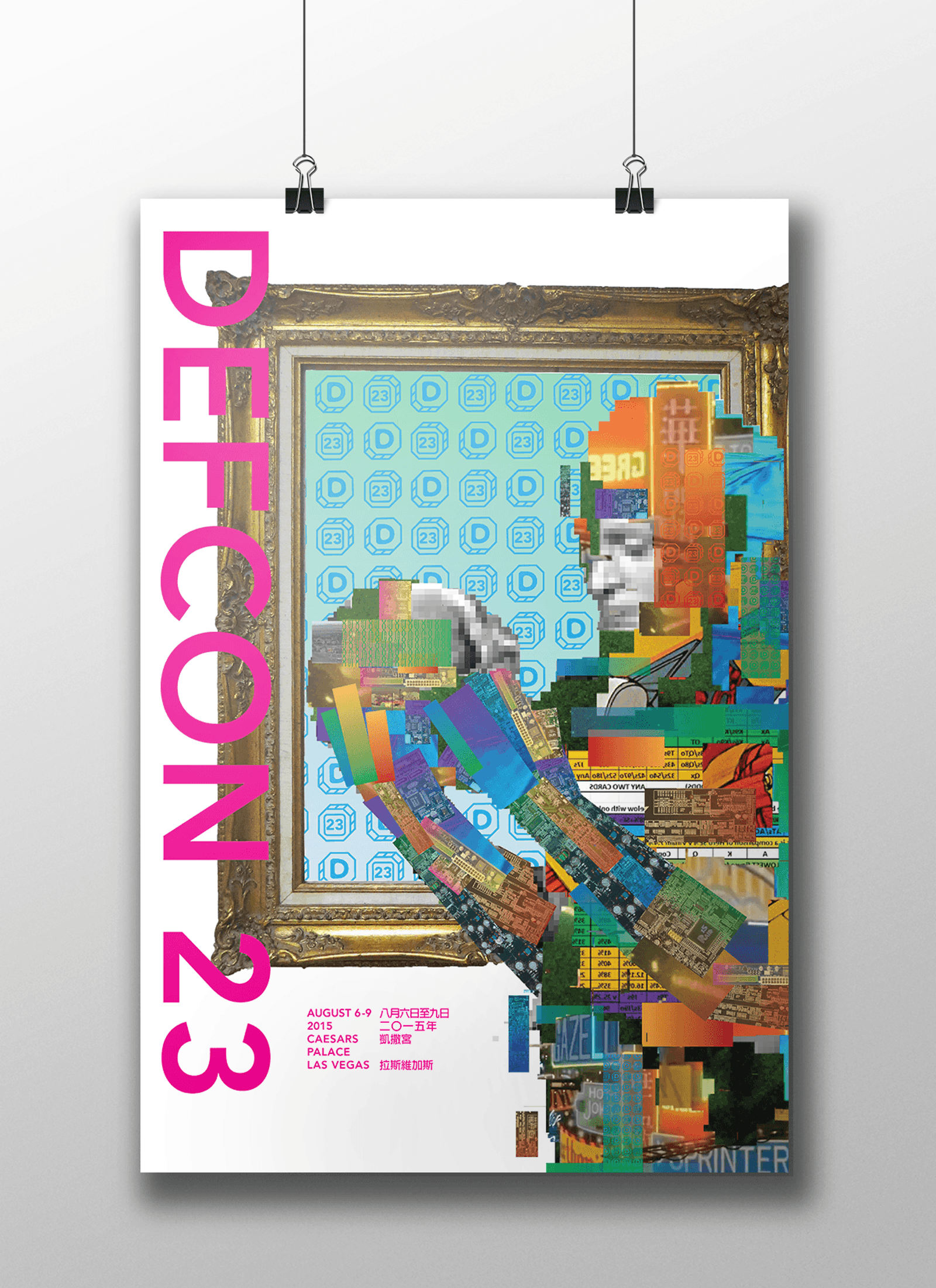
My final design and the one I ultimately settled on is a more abstract representation of identity within the wired. I was deeply inspired by the illustration on the cover of the Japanese language edition of Neuromancer created by Yukimasa Okimura. It immediately made me think of the scramble suits in A Scanner Darkly, and the camouflage in “Ghost In The Shell”. I decided that I would use the imagery and language associated with decoupage, identity, distribution, assembly and completeness to represent the conference.
Gearing the rest of the promo material to the poster was fairly simple after I had created the poster. I created puzzles for the tickets (finding a pattern in the generated art on each ticket could lead to further numerical puzzles.) and I created the brochure with a simple pattern based on a binary system to represent the date and time of the talks. We were tasked with translating and setting type in one other language for the conference as well, so I chose Chinese, because I had no idea how to work with the language.
I learned a lot in this project, before this I hadn’t really set type in another language and learning to do it proved a challenge. I also learned a lot about organizing large design projects. Mostly though I really enjoyed creating an engaging poster and promo material for a conference I’ve wanted to attend since I was 15.


