Description
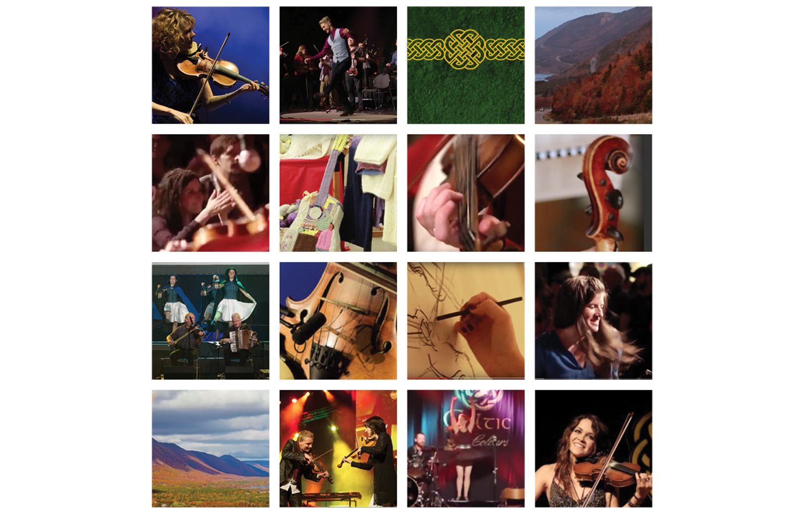
Celtic Colours is an International Festival held each year in Cape Breton Island, Nova Scotia. The festival takes place in October and last
Mission Statement
“To promote, celebrate and develop Cape Breton’s living Celtic culture and hospitality by producing an international festival during the fall colours that builds relationships across Cape Breton Island and beyond.”
History
“Since its introduction in 1997, Celtic Colours has grown to become one of Canada’s premiere musical events, and a cultural highlight of Nova Scotia’s tourism season, collecting accolades from regional music awards to national and international tourism awards. The festival has also been successful in extending Cape Breton Island’s tourism season well into the Autumn, and introducing the musical culture of Cape Breton to tens of thousands of visitors from more than two dozen countries.
Cape Breton Island is home to a unique combination of music and culture, inspired by 19th Century settlers from Scotland and Ireland, and influenced by the Aboriginal Mi’kmaq people, the island’s physical geography, and the waves of immigrants who populated its communities during industrialization. Generation after generation of settlers, from the Scottish and Irish to the French who came before them, were able to maintain their culture and traditions in this new land due in part to the island’s isolation and subsequent lack of outside influences. Music, language, dance and community played an important role in each of these cultures and continue to do so today.”
Target Audience
Anyone who has ties or is interested in Celtic Culture. The Festival offers workshops for younger audiences who would like to learn more about this culture and it also has a classic feel for a more mature audience, so their targeting audience would be between twenties and fifties.
STINGS and COLOURS.
My main objective was to give the festival a new image, that wasn’t the used up celtic knots and gold letters on green background.
After extensive research a common element started to appear, “Strings”. Celtic music uses a variety of instruments, but at the core it is obvious that the stringed instruments are the ones that dominate. Also, the celtic knots are made of strings. Which is why the main theme of this new design was strings and fall colours (red, orange, and yellow).
Poster
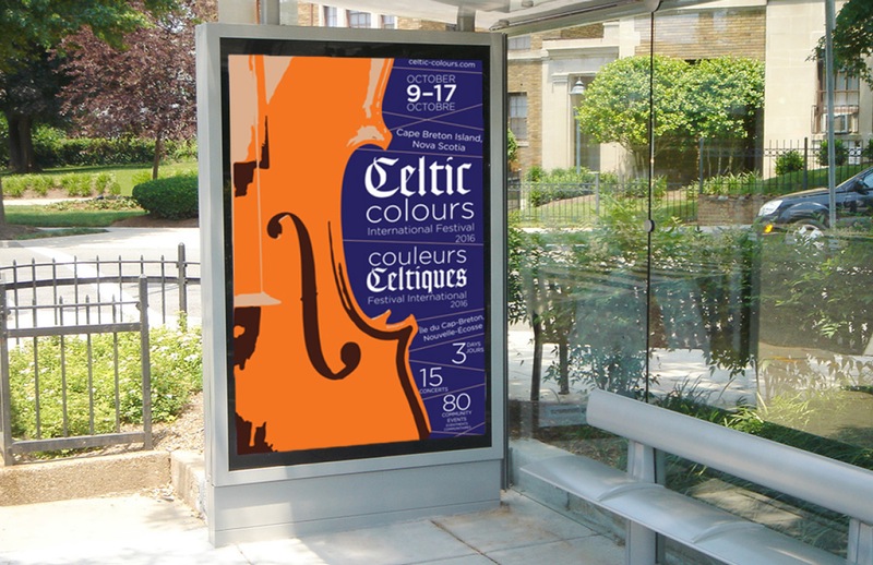
The poster features a violin, which is the instrument at the core of this festival. It also has lines going across it that seem like strings from the instruments.
The orange was brought from the coloration of the leaves during the fall season. This ties in the other major attraction of the festival which is the scenic view of the island during Autumn.
Tickets
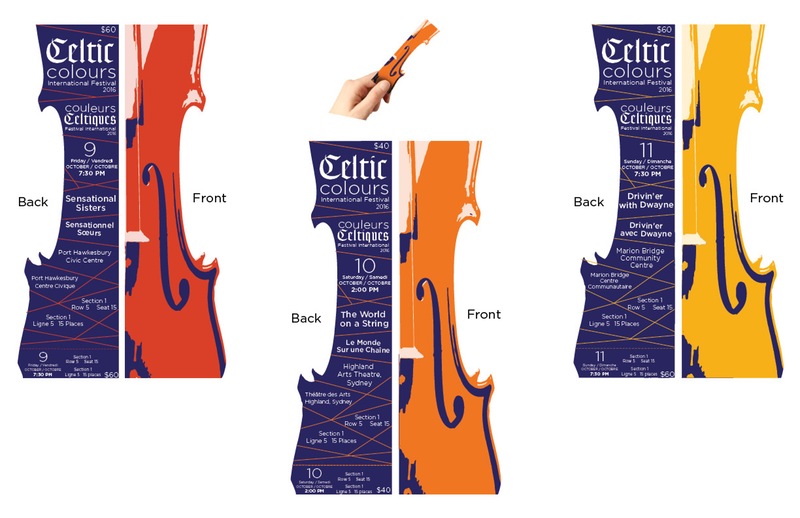
The tickets are shaped like half a violin, like it appears on the poster, The back of the ticket contains the information of the concert. Each piece of information is separated by strings. Every day has a different Autumn colour to make them easier to tell apart.
Information Program
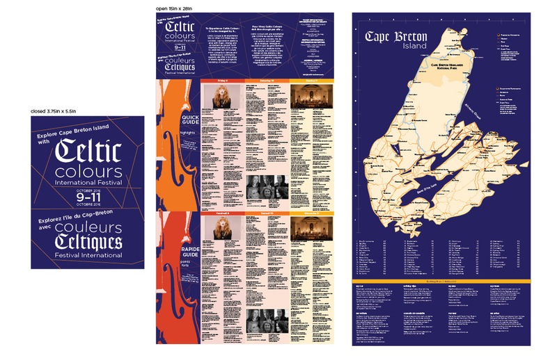
Since this festival takes place all around the island, most people travel from city to city in car; when they get to a city, visitors usually park their car and continue exploring on foot. This is why the program had to be informative of what the festival featured, as well as be mobile enough for people to carry around in their pockets or purses. A map was also a must since people attending the festival have to know what are the participating cities, where they are located, and how to get there.
These points had to be resolved in order to have a successful festival because of tourists got lost or didn’t know what was going on, they would end up missing parts of the festival or get frustrated and give the festival a bad review to their acquaintances. Also, since the festival is being held in Canada, all information had to be written in English and French.
The major challenge I encountered was the amount of information that had to be included in the program. Even if it was just for three days, there were many cities involved, and for every city there were at least three concerts/events held everyday. There was just too much to be included, especially since everything had to be in two languages, and it would probably confuse the viewer. Another challenge was how to separate the English and the French, but still make it look like one cohesive design
The solution to the amount of information was to make the printed design a “quick guide” which would feature the biggest events being held in the island, which would appeal to the targeted audience. This quick guide would be paired with an app that would have all the information separated by cities and dates to make it easier to find your way around. The language part was achieved by separating the languages in different fold of the program. The information alike would be colour coordinated to know what information was the same.
The solution I came up with was to make a pamphlet that would fold down to be 5 x 7, in this size the pamphlet will be able to fit in most back pockets and purses. When opened completely the pamphlet would be 15 x 28 in. Even though I designed it so you could access the information when it is folded to 15 x 14, to be opened in a car or tight space, it can also be viewed completely opened when being in an open space. Each fold can work on its own, and as part of a whole.
App
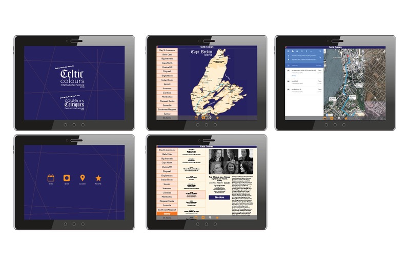
To be able to have all the events on the go, an app for tablets was designed as an extension of the information pamphlet.
Ephemora
The Celtic Culture International Festival takes place in October during Thanksgiving Weekend.
October is when it starts getting colder. This is also the time when people underestimate just how cold it can get, specially if you are outside at night.
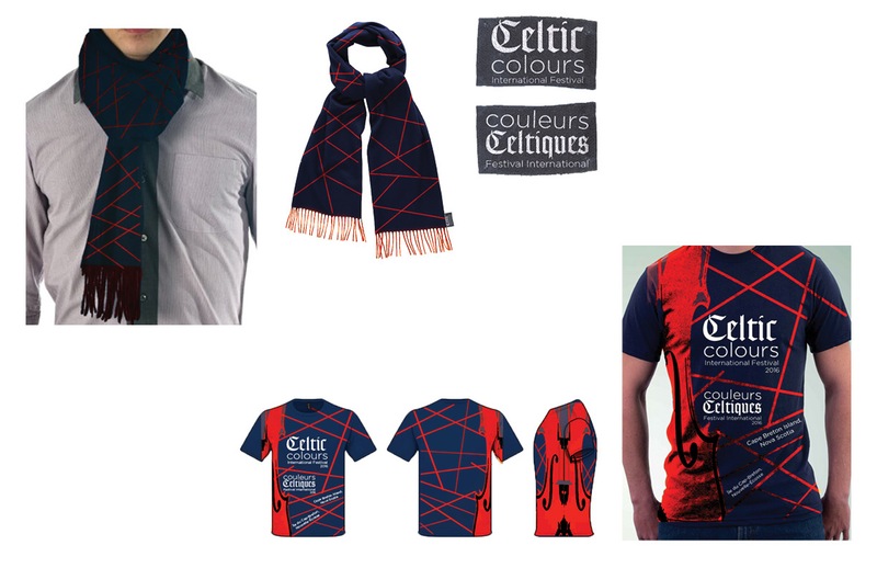
This is why a scarf is a perfect ephemera for this festival.Of course no festival is complete without a shirt of it. This is why one was created following the design of the poster.
