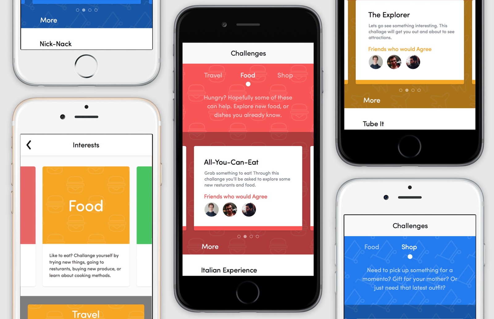
Discover the places around you. Ploratory helps people find interesting locations and places of interest through challenges that can be completed individually or with friends.
When thinking about the app I wanted to make, I was inspired by some of the other services I use, such as Foursquare and Swarm, Yelp, and other services that help users find places to eat, or things to see. Exploration was one of the big ideas I worked with when designing what the app should do.
Many people may not go to many of the local experiences that a location may offer. They could be in a new place, or just still to the same routine of where to eat and what to do for entertainment. Building an app to help people explore and step outside their personal boundaries can help the user find new and interesting places.
For my prototype I worked with Quartz composer and Facebook’s Origami. The user can select a few categories to narrow down their interests and then receive challenges based on those. For example if a user selected ‘Food’ as a category then they would get challenges that might try to get them out and try some local cuisine, or something they had never tried before.
High Fidelity Screens
The visual style of my app was inspired by some other apps I use such as Duolingo, Rooms, and Foursquare. I really enjoyed the use of parents and colour in Rooms by Facebook and felt that this look and feel could by used in Plorartory. I wanted it to stay minimal as functionality was my main intent, but still have a sense of energy and detail.
At this stage I fleshed out a few more of the screens and how they worked, including some of the basic login screens as well as how things such as settings would work, how you could delete a challenge, etc.
Motion Video/Prototype
For the motion portion of this project I decided to prototype my app using Quartz Composer. Quartz Composer would allow me to actually interact with the app and have fine control over the animations and feel of interactions. For example, how much force would need to be applied in order to swipe over to the next category.
One of the first issues involved in this stage was that I had designed my wireframes and mockups for an iPhone 6. I own an iPhone 5 and wanted to be able to interact with it on the device. This meant that I had to take my design and make sure that it scaled properly to a smaller device. While this stage took me a bit longer, I think it made my app stronger by making sure it would work on different devices.
Ploratory from Taylor Emmerson on Vimeo.
Changes
Once I could add animations I decided that a few elements needed to be adjusted. I removed the solid bar that contained the categories as it still worked well without that element.
Current Indicator
For this indicator I tried a few different options to see what colour/size would work best. My first choice of a solid white circle. I tried some different colours, and a Half moon while I had the solid category bar.
Website
For my final deliverable I decided to build a single page website to highlight the featured of the app. I used similar patterns from my app to repeat the same visual language. Overall the site if very static, but I added some small parts that react to the user scrolling to bring some attention to part like the friends section.
I felt like the outcome was able to properly show what the app is capable of doing. If I was to continue this part of the project, I would aim to produce some animated screenshots, to help show how some of the functionality works. It also could be useful to provide a sample challenge and what the user has to do in order to complete this.


