Problem
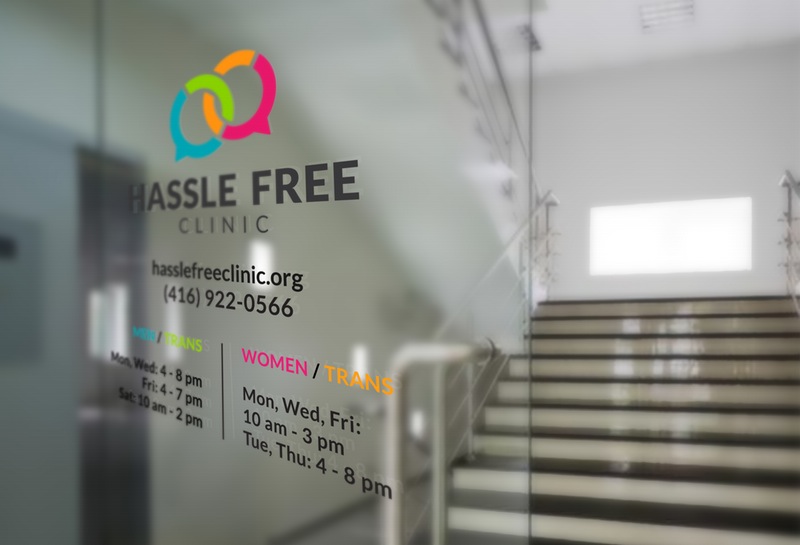
Hassle Free Clinic is a community-based organization that provides free medical and counselling services in many areas of sexual health for people of all genders. The clinic offers different service hours (clinics) for men/trans-identified and women/trans-identified. This undertaking step is to create a more efficiency, comfortable, and respectful environment for everyone to access the clinic’s service. Trans identified clients can attend wherever they feel most comfortable. It is important to present Hassle Free Clinic as a gender-free clinic, and eliminate the perception of Hassle Free Clinic solely being a “gay-only” or “gender-specific” clinic.
Hassle Free Clinic is the largest anonymous HIV test site in Canada, and is one of the country’s busiest sexually transmitted infection (STI) clinics. The old branding did not create a strong reputation for Hassle Free Clinic as one of largest and most influential sexual health clinic in Canada with over 40 years’ experience in the field. The entire branding system appeared lack of profession and experience. Also, the old Hassle Free logo did not appear as welcoming and accessible as the clinic’s philosophy.
Solution
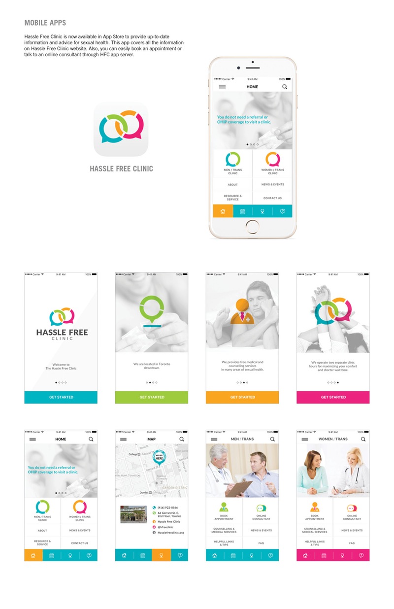
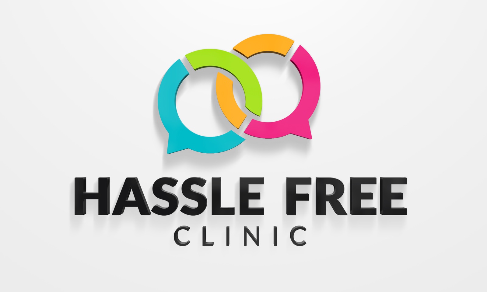
The new identity was designed to represent Hassle Free Clinic as a reliable, friendly, and approachable sexual health clinic. The new Hassle Free logo is meant to be welcoming, supportive, reputable, unity, equality, and diversity.
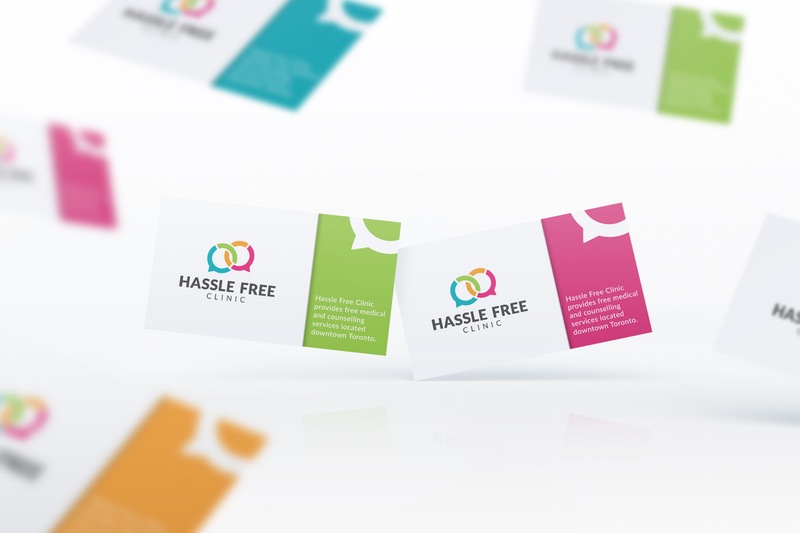
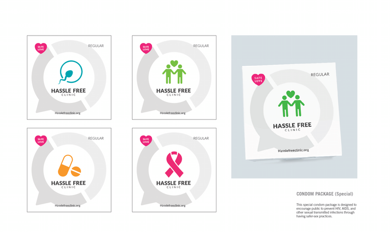
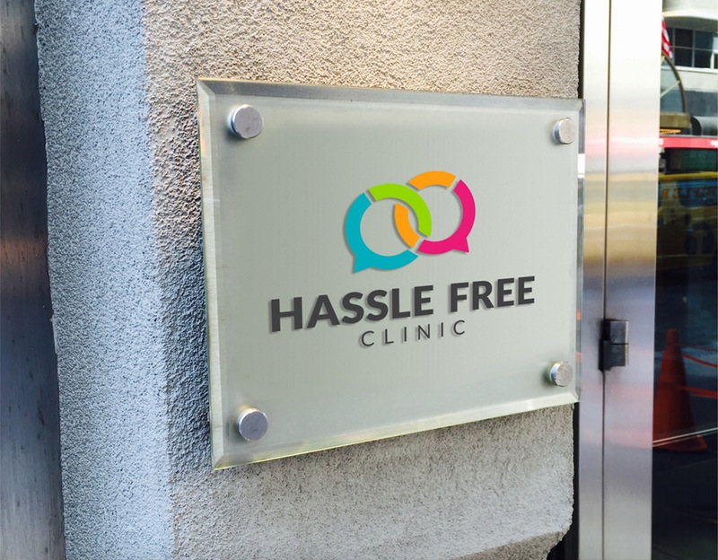
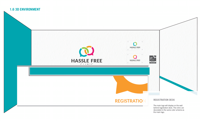
The new Hassle Free log is made up two basic elements: a graphic icon, and word-mark (e.g. the words Hassle Free Clinic, Women / Trans, etc.). The graphic icon is a set of speech bubbles, which suggests the informal and respectful environment inside the clinic. The shape of speech bubbles is inspired by standard gender symbols. A set of speech bubbles was designed to have a look to show that they were both separate and connected to each other. The design concept of this graphic icon is to suggest the clinic provides comfortable and respectful service to all gender groups.
